I meant to come back and comment.....I loved this shot but did not get a chance to vote it. To tell you the truth, I like it better as a statement than as a challeneg entry simply because it's such a great shot. I wholeheartedly love where you were coming from in the challenge as well.....and if you look at my profile and follow it to my entry, you'll see what I mean!
loved this image in voting and its probably one of the best uses of selective desat I've seen in a while. Way underrated, but I guess you kinda had to expect that here.
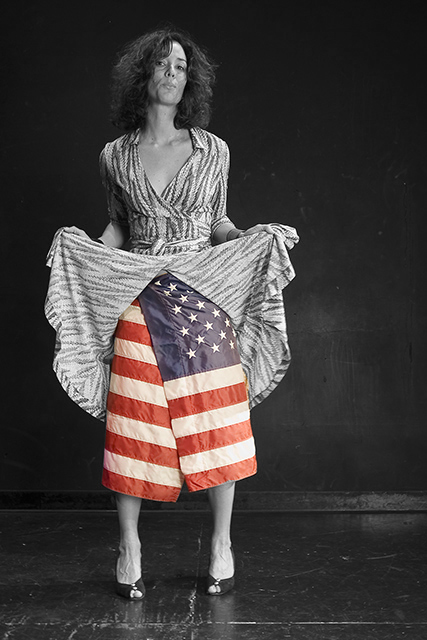
I see color in the picture. On DPC this does not do well with the voters and your score would have said it all by now. Well I would not punish this entry for it.
I do not think highly of this picture. I think the pose and look of the model are uninterested, which is probably not what you intended to picture. Floor and background are messy and distracting. The coloured flag ignores the theme of the challenge, and this type of photoshopping is far from original nowadays.
Last but not least, I do not value patriotism as something positive, but rather as a means of manipulation. Patriotism is not a bad thing by itself, but it is misused by governments to silence political opponents by labbelling them unpatriotic.
Sorry, I really like this shot. The selective desat takes it out of the competition. I gave it a 9 and as I came back had to hit you with DNMC vote. 5 because really like it. Should be a 4 or less in my little voting pattern.
I bet I know what you are getting stung on.. the colour in the BW challenge.. look, its a great idea and all, but completely dumps on the whole idea of the challenge. I am generally not a DNMC nazi, but in this case I will be.. 3
I'm sure your getting kicked aroung for the color in this, but I think it is really cool and great out of the box thinking. My vote will reflect your bravery and creative thinking.
Nice out of the box thinking but you would have scored higher and still had the same effect in my opinion with the flag still being B/W. I like the ideal and photo.
Hmm. This is an interesting image for me. My first thought was that the flag shouldn't be used like that. I know people do stuff like that all the time but it still kind of gets to me. However!! I'm putting that completely aside because that really doesn't have to do with your photo. I mean yeah, it's possible to present something in a way that is more offensive and maybe worthy of a score drop, but this is not it. So. On to the actual photo.
The first thing that jumps out at me about the image itself is that there is color. But I think that you used it well. This still fits the "B&W portrait" idea for me. Plus, there really seems like there is a good visual reason to have the selective desat (as opposed to a couple other images I have seen in this challenge where it seemed a bit to me like the color was in there "just because").
Tones are good, I like the composition a lot - the negative space seems to be just the right amount, and positioned in the right place. Everything is nicely lined up (the lines of the floor and the wall are very balanced / symmetrical). The wall and floor give the model a good context to be in - I would not have liked this image as much if it had been like some of the studio shots you see with a pure white or black background where it looks like the subject is floating. The pose is good. The way that she is standing, tilting her head, the expression on her face.. everything just works together very well I think. Even the irregularities on the floor and the spots on the wall add to the image for me.
The only negative thing I have to say is that I feel that the title does not have as much of an impact as would fit an image of this calibur.
I really feel like this is one of those images that I come across on DPC periodically - one that deserves to be in a news magazine's "photos of the year" edition. Congrats on a wonderful photo and good luck in the challenge.







 Add photograph to your favorites
 Add photographer to your favorites


 Photographer found comment helpful.


