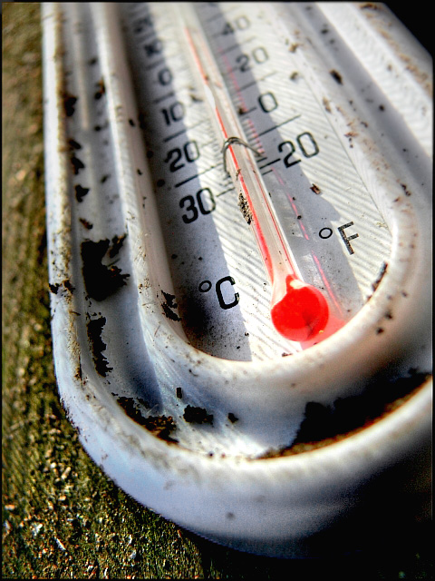
Somebody else did a close-up of a thermometer and my comment to them would apply to yours too. It's a very neat, well taken shot. Clean lines, good focus. Your composition is strong too. But the one thing lacking are complementary colour tones. Right now you have a good stock photo for thermometers. But imagine how much more evocative the picture would have been if you'd gone with a cold colour scheme (blues/purple) and a cold temperature on the display, or a warm colour scheme (reds/oranges) and a hot temperature reading? Just a thought. Still a good shot.







 Add photograph to your favorites
 Add photographer to your favorites


 Photographer found comment helpful.


