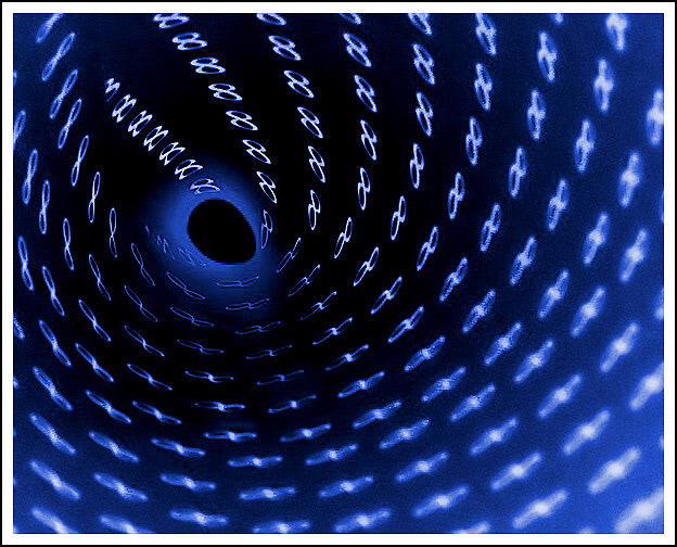
Great concept! Too bad the compression artifacts looks like they took a toll on this image (looking at the right lower front and around the "hole" at the end of the tunnel). But don't get me wrong -- I like it!
Unfortunately, it looks more like a hole 8's because of the posiiton of the infinity symbol at the center. The center is also pixelated. Nice negative and coloring though.
Cool idea. Really creative! At first I thought you did this with a computer, then I saw where they overlap. This would have been a fine contender if it was cleaned up a bit. The hole is really jaggy and the edges of the picture are really noisy. Did you try getting the hole more round?
Oooooohhh.... My first 10. I like it a lot. Depth of field is good, Colors are very nice, gives a space-like effect to it. I also like the Escher-esque change from an 8 to the infinity symbol. good job
Nice abstract quality, with a composition that does sort of draw you in. Not crazy about the border, it keeps drawing my eyes away from the photograph.
this fuckin rocks hardcore dude. the colors and dof and movement - all first class. only niggle: the hole at the end might be better if it was a more perfect circle. nonetheless, a solid 10.
The clearest infinity signs look like 8s... it would have been good to change the orientation. I've seen this shot carried out much better in another challenge unfortunately, so you don't get the originality point in your score. Shame about the noise levels in the shot. 5
Would have been better if the focus was on the infinite signs and not the 8's huh? Just Kidding! This is very nice. I must remember to try this technique.







 Add photograph to your favorites
 Add photographer to your favorites

 Photographer found comment helpful.


