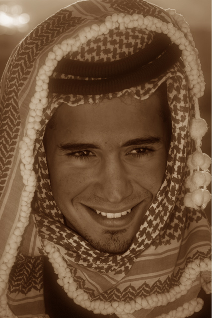
This is a wonderful portrait, full of character and is interesting to look at. It's unfortunate that you didn't do this in Black and White as the challenge called for. :(
Ignoring some people that say that sepia is brown and not B&W. I think the light in the top of your image is distracting. IMO some quick adjustments to shadows and highlights plus some curves would impove the image by bringing out both detail and dynamic range. Hope this helps ;)
While this is duotone, one might argue that it's not technically black and white. I hope the voters will not do you a huge injustice for that, but I'm inclined to say that I think the brown two-tone (or at least this bright a hue of it) was a poor choice for this subject. There needs to be greater contrast to frame the face.
A very good photo that will likely get clobbered for the color. The expression, texture and sharpness are all good, and there's nothing wrong with little toning, but the strong brown hues shown here tend to overpower any sense of B&W. The midtones seem a little flat, and I would suggesting cropping the top considerably to get the eyes out of the center, but the shot itself is quite strong. Nice job!






 Add photograph to your favorites
 Add photographer to your favorites


 Photographer found comment helpful.


