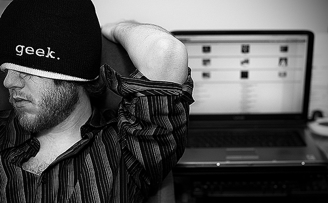
Thanks for all the great comments! I'm really surprised nobody mentioned the blurred DPChallenge front page on the laptop in the background. Regrettably I did over-sharpen this one and didn't notice the halo's until after the submission deadline.
I like what I like and I like this one. I can't break it down beyond the fact that it has a certain 'editorial' quality to it. And I just really like it. I ranked this way up. Good luck. Great photo.
I very much like the idea. A laptop on the background and a person that is looking away wearing a geek-sign: all very complementary elements. To me personally i feel you could have maybe placed them better. He looks away from us, which fits the geek part, but he also looks away from the laptop, which doesn't fit. Maybe placing the laptop to the left of him (from our point of view) would fit more in the story. vote=6
Nice :) You might get "the subject is going out of the frame" comments, but I think it totally works here. A great example of when breaking the rules works. 9.
Interesting arrangement and above average B&W conversion, but a little weak on image appeal. Personally, I prefer to have the subject looking into the frame rather than drawing the eye out of the photo. Those two sparkles on the front edge of the laptop certainly could have been cloned out in Advanced editing, too. Nice use of DOF.
gets better and better the more i look at this one ... about the 5th time thats happened while voting on this challenge ...
this is an excellent photograph .. love all the different types of contrasts going on ... =8
See the white line that separates his sleeve from his arm, or his shirt from his chest? These "halos" are caused by too much sharpening. It's also evident (but harder to explain) in his beard and even in the letters on his hat). Anyway, the main thing is ... sharpen the image, but don't over sharpen it.







 Add photograph to your favorites
 Add photographer to your favorites


 Photographer found comment helpful.


