Author Thread
Post actions
i like this one, even thought its bright, i think its great....
Comments Made During the Challenge
Post actions
way too over exposed and really grainy.
Post actions
Too blown out, but if intentional interesting
Post actions
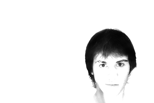
I would usually complain about the white background but in this case I think you have chosen well to capture the feeling of the title. I like it.
Post actions
i like the high key but the fact that the nose is missing bothers me.
Post actions
I'd like this better if it were framed a little lower so it didn't appear to be a floating head.
Post actions
Oh yeah ... blown away ...
Post actions
too white for me... but I think it was supposed to be white as it is...
Post actions
really neat concept.
Post actions
I like the composition, however IMO the lighting looses too much detail of teh face.
Post actions
Post actions
Wow! I like the minimalism of your image, but it's very washed out. I don't know if this was intentional, but it's a bit too washed out for my personal tastes.
Post actions
i little too blown out for my liking.. lose too many features
Post actions
way too much contrast and the higlits are absoulutely blown out...
Post actions
whoah...way over exposed.
Post actions
I like the simplicity of this photo. Maybe needs more detail burned into the nose region. It appears the model has a nose ring, I would have liked to see more definition. Like the composition. It is an attention getter!
Post actions
Striking composition, but not persuasive enough because it is so washed out.
Post actions
I really don't like the blown out highlights (but maybe it's trendy - there are lot's of them in the challenge)
Post actions
way to overexposed. You don't really see anything other than the air and eyes. It's floating.
Post actions
to washed out...no details
Post actions
For me personally overexposure does not add anything in this image.





 Add photograph to your favorites
 Add photographer to your favorites


 Photographer found comment helpful.


