Challenge:Still Life (Classic Editing) Camera:Canon EOS-10D Location: Home Date: Nov 1, 2003 Aperture: 11 ISO: 100 Shutter: 200 Date Uploaded: Nov 1, 2003
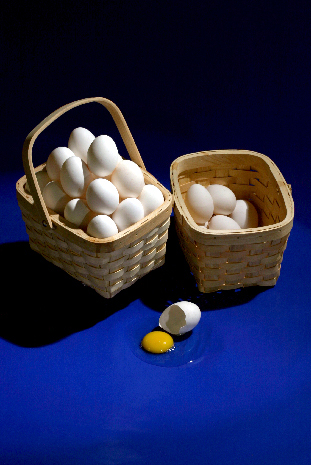
Just a tad of contrast increase, other than that it is straight out. Three flash heads, main on a snoot; one gold refl and one black. what you don't see is when I toppled the large basket balancing on a small glass and broke a half dozen eggs. After a good bit of clean up and adj'mts back in order, managed this and two other poses!
Statistics
Place: 67 out of 326 Avg (all users): 5.7466 Avg (commenters): 7.0000 Avg (participants): 5.8321 Avg (non-participants): 5.6222 Views since voting: 5205 Votes: 221 Comments: 11 Favorites: 0
Composition:
This composition shows that you have talent for both coloring and lighting. The vertical crop adds some definition to what you present the viewer. You've provided a continuous gradiation from the blue at the bottom to the black at the top on the righthand side while on the lefthand side you cropped into the solid shadow of a basket. The angle you chose allows you to show the viewer both the basket with many eggs and the contents of the less full basket which gives good object contrast. I like the broken egg as a visual cue to reinforce the "grain of truth" inherent in this saying. You chose and setup your physical elements well for your interpretation. I would also be interested to see what kind of impact you might create if you chose to zoom & crop with only part of the overfull basket and the broken egg. In my thinking that would be a more traditional shot, though, and I think you have created a unique composition with your choice of a vertical presentation.
Color:
My initial feeling is that one of the more important color elements of this photo is the yellow of the yolk on the blue background. It immediately presents a contrasting color for both the blue and white (perhaps complimentary for the blue; I just don't have my color wheel handy right now). The natural coloration of the baskets help to reinforce the organic curves of the eggs. Good use of 4 or 5 basic colors to present an idea on a couple of levels.
Lighting:
Now here's another area where you stepped out a little from what I might expect. The lighting is almost too harsh with hotspots on some eggs in the overloaded basket. The shadows are also strongly defined and yet the don't seem to add any particular nuance to the presentation beyond another "color". The shadows produced don't seem to present any special texture to your composition. I do like the catchlight within both the yolk and the albumen as well as the less harsh shadow within the broken egg shell. I would be interested in seeing this same photo with a scrim or some diffuser cutting the glare a little on the subjects.
Focus:
Pretty good focus. I don't know if you USM'd this shot or not. It looks like it has a decent focus but because of the amount of space you put into the top and bottom and because the photo is cut down for this competition you weren't able to present very close looks at any edges. I have no doubt that you have sharp focus in your original and that some of that sharpness might have gotten lost in the translation to DPC's resolution.
Overall:
This is a good approach to still life and you selected good subjects to work with. You created a good color scheme and you definitely have your take on the lighting. I think the lighting and the cropping make this a unique presentation and it is that different look at this common adage that makes your photo a fun presentation to look through and a challenging to view for others to apply to their own creations.
I like this image. It is pretty original. Good lighting and I like the color of the background. I would have personally liked to have seen you either get in closer, or crop tighter, but other than that I like this image.
I really enjoy your composition here, very nicely done. I like how you set up your still life to make it really interesting, for me, it is very pleasing to look at. I love the lighting here a lot! It really gives the eggs a nice texture. I alos like the contrast between the blue background, white eggs, and yolk. Very well thought out. Honestly, for me, I wouldn't change anything here in this picture, and even if there were anything to change, it would be extremely minor. Good work!







 Add photograph to your favorites
 Add photographer to your favorites

 Photographer found comment helpful.


