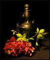
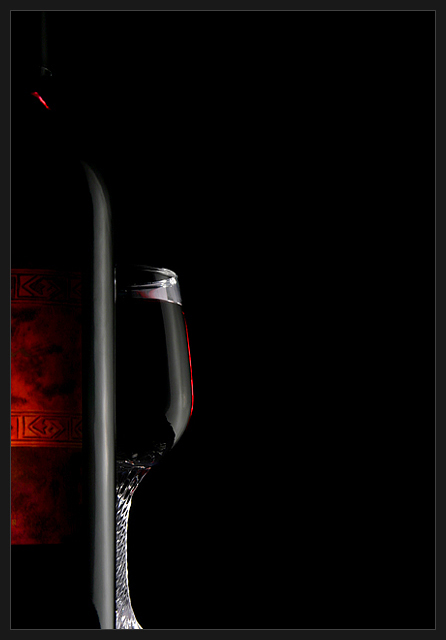
Just want to say a big thanks to John who advised me with lighting and who's exposure tutorial helped me with this shot. Back/Side lit with my trusty desk-lamp, with white boards either side, and a lit match to create the glow that lights up the label in front.
Statistics
Place: 19 out of 326 Avg (all users): 6.2203 Avg (commenters): 7.8750 Avg (participants): 6.1269 Avg (non-participants): 6.3431 Views since voting: 2151 Votes: 236 Comments: 26 Favorites: 5 (view)
Deliciously deep dark reddish-black - totally in keeping with a suggestion of fine wine. Well framed, and very brave use of all that negative space. Now one of my faves.
nice lighting, and nonconventional composition - I like how the light brings out the touches of red on the glass and bottle. and I like the extra light on the bottom of the bottle from the other side - well thought out.
IMHO this shot begs for a little more detail (or less detail) in the bottle...I keep trying to figure out what the label says and that kinda detracts from the overall impact of an otherwise simply elegant shot!
TC
I like the minimalistic approach, emphasising shape of bottle and glass and the warm color of the wine. A bit more light on the top of the bottle to also see the outline there would be even better in my opinion.
I'd be really interested in seeing if anybody can actually find something to critique in this photo.The use of negative space and color contrast& rhyme is just awesome. Amazing work!
I really like the use of negative space, and how the glass looks like it's filled with the blackness behind it. Only the glint of red (and the title!) lets you know it's wine. Very good job--top 10 if not a ribbon
I really love this image. Fantastic use of negative space, excellent deep color, perfect highlights on the glass and bottle. For me there is nothing to critique.
ah yes, negative space.....hmmmm......if that were the theme this would be ranked higher in my mind than a theme that is still life....I appreciate it's use but the shot of the wine bottle and glass is so wonderful I REALLY want to see more of it.
Very nice shot. Only thing I can say is that the loss of the top of the bottle doesn't allow the eye to finish the journey up the photo. A little light thrown on the top would have completed this.
too dark ;P just kidding! i love the drama. cool way to compose the shot. good use of negative space. i'd like to see a little more light on the top part of the bottle. technically this is a really good shot but it actually doesn't have a lot of emotion for me personally. it does fit the challenge well though which is more than can be said about a lot of these pics.
Very interesting--I like the overall mood portrayed in this photo, and you've got the lighting right-on. I'm normally a fan of negative space, but I'm finding that there's just a bit too much space on the right. Great submission overall. 8






 Add photograph to your favorites
 Add photographer to your favorites

 Photographer found comment helpful.


