This was a quick PP for the procastination Challenge. I barely missed it because my laptop froze like 20 mins (at least it took me that time to make it work again)
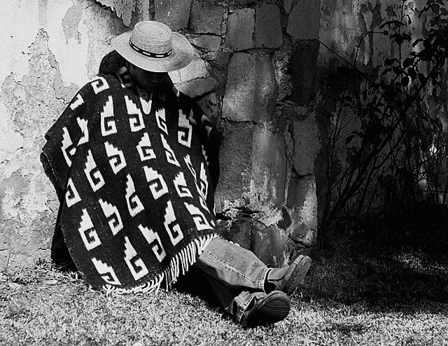
However, the light from the left is too bright and can be toned down thru PP. I agree with the crop and with making your subject centered, too. The right portion of the photo is too busy for me, IMHO. :)
I think that if you cropped it really tight (on the left JUST outside his pancho and on the right just outside his toes) that you would find it a much more dynamic shot while still keeping the entire tonal range. I agree with Jayson ... the space on the right is WAY too busy (TMI} ... and I don't think that the lighting on the left side would be too harsh if there was less of it. Just as it happens, cropping it that way keeps the subject's head close enough to the "rule of thirds" department which is kinda like what some people say about chicken soup. It might NOT cure what is ailing you ... but it can't HURT!
The clean high contrast on the right side of the image seems to compete with the buzy dappled shade are. The poise of the person is nice, however the busy space on the right does not work well with the B&W. I acutally prefer the color version. Still a nice capture overall.
reallllllly coooool idea here! i love the pose! the legs crossed especially send the message that he's just chillin' out..and not gettin' anythin' productive done! :) Unfortunately the lightin' isnt workin with ya on this one... it's really harsh on the wall on the left. aside from that... GREAT STUFF!




 Add photograph to your favorites
 Add photographer to your favorites


 Photographer found comment helpful.