I wanted to enter a shot that reflected the way I see things, rather than worrying about getting a good score...
Fooled around trying to find my original formula.
Curves, calculations, dodge and burn, grayscale, LAB lightness, grayscale again. quadtone, bit of cloning, cropped smart sharpen.
Statistics
Place: 342 out of 712 Avg (all users): 5.7791 Avg (commenters): 8.0000 Avg (participants): 5.6756 Avg (non-participants): 6.1098 Views since voting: 1612 Views during voting: 454 Votes: 344 Comments: 36 Favorites: 17 (view)
Oh and another thing, I sometimes feel sorry for you, as I do for any great artist, because you can't see your own photos the way the rest of us can. I hope ed, jj, xion, boysetsfire, et al can cheer you up on that account. :)
whew... I thought you were losing it... my last 4 scores for you were 7, 6, 5, 6... but at least you've shown you know what your best is. :P
But in case you don't, let me tell you. Your best photos are the ones that threaten to fly apart, or crumble, or dissolve. They are in some way on the edge of disappearing.
Because the best photos are not about a subject, they are about the experience of looking at the photo. And when you as a photographer take a risk, take the photo to the edge of visual chaos, and when the viewer is almost as brave as you were, then a tremendous experience occurs at the moment (or should I say eternity?) of viewing, a true adventure, an exploration into what is possible and what is impossible but happens anyway, somewhere we can't quite reach.
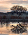
this reminds me of xianart. I love this image. It is simply magnificent. Epic and intimate. Utterly mysterious but full of stories. Abstract and representational at the same time. divided into sections that resonate with each other like tuning forks. I give this a 10, and whatever else I can give it.
Great concept, but too contrasty. It would really help to be able to see into the distance (where there's nothing but solid black shadow now) to give a sense of what the kid's dreaming of.
I like this. The cross on his back is cool. I think you could have cropped out the light bit at the top because at the moment it's competing for my attention with the boy. Overall. It's pretty good.
Best: Uh-oh, we have an "artist" on our hands...the exposure and mood is spot on
Worst: I wish the boy wasn't so removed at the bottom...he almost feels too disconnected from abstract upper half..






 Add photograph to your favorites
 Add photographer to your favorites

 Photographer found comment helpful.


