Author Thread Comments Made During the Challenge
Post actions
not much contrast. also very small
Post actions
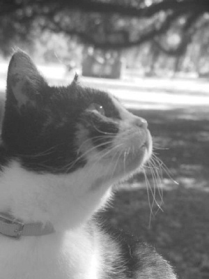
Lighting is a little flat here.
Post actions
This is really lacking contrast
Post actions
More contrast would add a bit of punch to the shot? The blacks are very light as it is.
Post actions
more contrast would help this, and perhaps levelling the background.
Post actions
Too out of focus and bright for my taste. Sorry.
Post actions
cute cat but too small, no contrast, and not sharp enough...
Post actions
Washed out and flat. Needs more contrast. Looks like it might have been brought up in the Shadow/Highlight feature in CS2.
Post actions
Too small. Lacks crispness.
Post actions
lacks contrast and is not very sharp
Post actions
Looks a bit out of focus.
Post actions
This is a cute picture of the cat. Unfortunatly the washed out look really detracts from it IMO.
Post actions
Post actions
Could do with a bit of contrast.
Post actions
I think he lightng could be greatly improved. the burned out background is distracting
Post actions
Too small and you cropped part of your friends head off.
Post actions
Angled horizon, low contrast, not a particularly interesting capture. Sorry.
Post actions
For me it's too small and not enough contrast, Good Luck 3





 Add photograph to your favorites
 Add photographer to your favorites


 Photographer found comment helpful.


