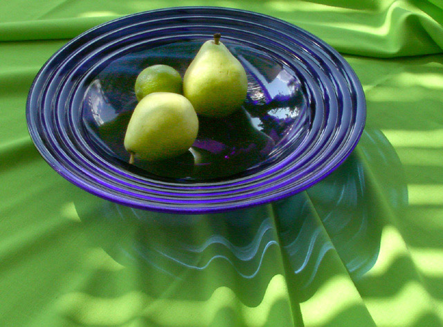
Good concept. Patchy execution. I'll elaborate. It's not very clear in terms of resolution, and I don't think that's what you were going for. The textures that mix together in this photo could very well spell the difference between your 6 and, say, an 8. Not a huge fan of the dish, although I like the transposition of wrinkled blue on wrinkled green. You should be commended for making green and blue look good together as well; not many people do that correctly.
Interesting use of two strong main colours. Non centred composition is a good idea but the bowl sits too close to edge of frame at left and even more so at top for my tastes - needs space within the frame.
nice color use. love the interesting effects and patterns caused by the reflections , the ripples and the plate. given the cropping, perhaps having the bottom folds of the table cloth at more of a diagonal would 'lead' one into the picture more.
great colour contrast , i think the colours may have been slightly oversaturated. I can see a touch of purple in the pears. the light ripples over the cloth nicely
The blue plate is a nice contrast with the green and I like its refracted image on the tablecloth. But the overall image is too soft and I find the noise distracting.
One of the few good shots entered. It’s a classic still life. Nice simple subject, great colors, interesting textures and neat shadows. Good luck, hope it does well.
Wish this had a better focus. Nice concept, and colors. I like the shadows on the rippling green cloth. Lighting is interesting, and pleasing, very soft.







 Add photograph to your favorites
 Add photographer to your favorites


