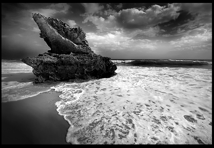
Took this at the Portsea Backbeach. Had it in the portfolio, and thought it was a strongish pic.
Basically levels, curves, grayscale etc...a little dodging and burning, usm, blur, sharpen bits, resize and frame
I like the strong details and contrast. Last year's 'best of' got me 5.9...hoping this is an improvement. 6.4???
POST: Thank you so much everyone for the fantastic comments and a great result for me. I improved a full 1.0 from 2005's image, and to come 32nd out of 700 images is a great thrill for me. Thank You, Thank You, Thank You...
The Vignetting was a problem for me. I really should have pulled back on the left, but for some reason, when I would save for the web, it came out darker and I couldn't figure it out. Time ran out for me and I didn't want to re-edit, so I left it as it was and obviously lost some points for it. If I had it to do all over again, I would have burned a little less. I am happy with the tones and contrast.
Here is the original...crazy what you can do in Photoshop!
Statistics
Place: 32 out of 712 Avg (all users): 6.8760 Avg (commenters): 7.9024 Avg (participants): 6.8208 Avg (non-participants): 7.0595 Views since voting: 1919 Views during voting: 570 Votes: 363 Comments: 51 Favorites: 4 (view)
Enzo, I had to go back and look at this one from 06. Comparing with your current ribbon winner the contrast is amazing. This one, while very good, has distinct processing with heavy darks, shocking clouds, and an overall look that screams 'processed'. In comparison, your newest edition has all of the drama but with the slightest touch of processing...just enough to really make the picture WOW! In particular, your sand on the ribbon winner is amazing. Your newest one is like this one 'all grown up'. Keep up the great work! mark
Sorry, Enzo. You didn't nail your goal. You'll just have to settle for 0.5 higher. :) Congrats on this awesome, awesome shot and very high placement! :)
Return for comment. Excellent choice of BW, very nice composition overall. I'd have been curious though if it might have worked better with the lizard facing into the scene (the other side)
wow. excellent composition. love the juxtaposition of the foam, the fluffy clouds, and the razor sharp edges of the rock. like an undertow, all the soft lines grab you and pull you in. love the hidden/implied violence that comes through the bw.
Very powerful wide angle shot... excellent B&W conversion.
If I can be really picky... I am not sure about the Vignette.. (effect or due to the lens?)
there also appears to be a 'soft' area in the bottom right low third.. not sure if this is a lens smudge?
Lovely in black and white! My only nit would be just a wee bit too much burning or vignetting on the left above the waterline but it does have excellent visual impact.
VERY cool image. Yeah, I see the lizard for sure. Only critique would be that there was no need to go so dark along the left edge. Other than that, WOW! Good luck.
Really like the way the wide angle creates such strong leading lines all pullng the eye right into the scene. High contrast black and white works really well to bring out the details. The shadows at the lower left, top left and along the top edge of the frame are a bit heavy for my preferences though.
one of my faves - I love the highlighting - is this all natural or is this in processing? it's just perfect - great choice in B&W - I'd be curious to see a color version - real nice job :)






 Add photograph to your favorites
 Add photographer to your favorites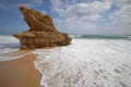


 Photographer found comment helpful.


