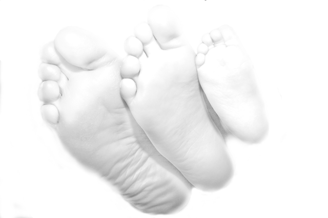
While I agree that the photo was a bit over blown I had alot of trouble getting the mothers foot to look good without really blowing the photo.
So I was going for an angelic look. (The mothers foot was at least 10 shades darker then her kids)
One unexpected benifit is that the photo actually looks much better like this when printed and thus the client loved it.
Thank you for all the comments and yes it was my intention to try something a little different.
Maybe getting a lot of DNMCs on this one, but I like it quite a bit - very creative. Only complaint is that the baby's foot seems to fade out a little too much. 8
A portrait consisting of three feet? You will probably have your reasons for this interpretation, but I don't get it, and I don't think it yields a pretty picture either.
Dang.... for me I generally consider a portrait to be an image that includes the face (human or otherwise). But this image, I love it and still feel that it in some ways meets the challenge. What a way to force me to rethink things!
I've always thought that there really has to be a good reason to take pictures of feet. :) Interesting composition and all, but the ultra high key isn't great, and in my opinion the subject is just unappealing, fraught as it is with all its odd textures and lines. 5
Call me traditionalist - but to me a portrait indicates that there's supposed to be at least part of a face in the picture. Besides that the highlights are blown and all in all I thinks this is not good at all.





 Add photograph to your favorites
 Add photographer to your favorites


