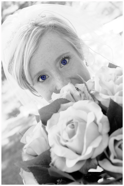
Aside from the fact that blue eyes are not B&W, the eyes being the only thing in color really doesn't work for me. Maybe try doing a selective color/desat on the flowers? But just the eyes only looks a little odd. 4
Colour in a B&W challenge . . hmmm.
To be honest I can really like this sort of thing, but I think the main picture is a bit too light, and the eyes are over saturated in contrast to the rest. Try desaturating the eyes, and making them a bit lighter. Possibly even putting a little colour back in the roses. It's a nice picture that would have scored higher without the blue.
I think you'll be punished for the selective desat...not only cos it may be seen as DNMC, but it really doesn't add anything to the image. In fact I think the blue may take away from what may be some cracking eyes under there, with a bit of dodge and burn....however all I see are blue blobs
like the angle though
The blue eyes ruin what, I think, could have otherwise been a decent portrait. In the thumbnail you can't really tell and so I was very shocked when I saw the larger image, and it is not pleasing, at all.
This is almost scary. I am not a fan of selective color, but can appreciate it if it is done well. Her eyes are way to saturated. You should had desaturated a little instead of going the other way. It should be reall soft not scary. The rest of the portrait is pretty but I have a hard time seeing anything else but those eyes.
Okay...seriously, I know you were going for a nice effect of isolating the color of the eyes against the rest of this composition, and you've done a fine job of that, but I find the effect very unflattering and...well...a little creepy even. Post-challenge, I might suggest two-toning this in a dark blue to match the hue of the eyes and complement--not isolate--them. Just a suggestion. 6 from me.






 Add photograph to your favorites
 Add photographer to your favorites


 Photographer found comment helpful.


