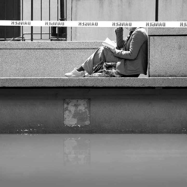
She lost her head in her book, she didn't see the DANGER coming.
Disqualification Details
Your submission must be taken within the 2006 calendar year. You must ensure that your camera date and time are correctly set to your local time zone before shooting your entry. If the date recorded in your original image file is not within the specified challenge dates, your entry will be disqualified -- NO exceptions!
The tonality of the photo is good, there are many contrasting tones that make this photo nice. The lighting and composition of the woman read is good. I will say I did laugh a bit when I saw her head was "cut off" The detail in the photo and overall sharpness of the photo are great as well which is important when dealing with B&W. IMO, however, the overall feel for the photo is its a bit flat. There is nothing in the photo to give a feeling of depth( no strong diagonals or verticals) and the horizontals make this feel for me( again just my honest feel) flat.
interesting graphic image but I think I'd rather have no person or her head. Its slightly funny with her head cut off like that but not enough to make me really enjoy the image.
hmm regnad, It seriously looks like you have lopped off the top of her head.
And by no means is that a bad thing, it is such a calm image yet that regnad sign fkips it on its half lopped off head. I like it. 7





 Add photograph to your favorites
 Add photographer to your favorites

 Photographer found comment helpful.


