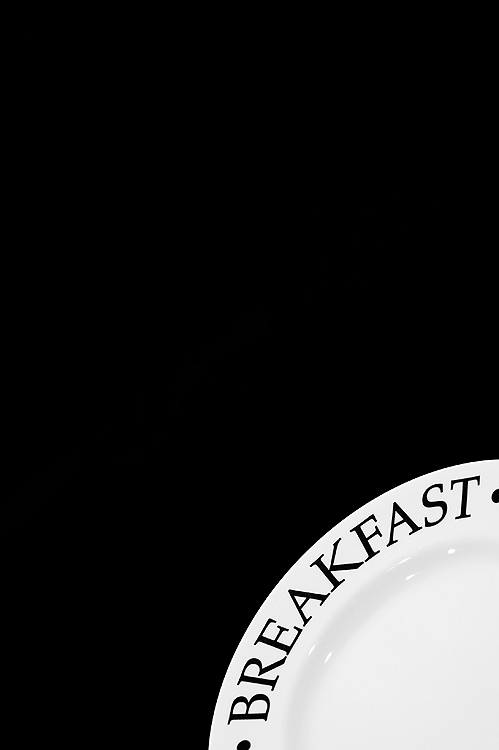
The black & white tones really stand out well and pop out in this composition. I just have to point out an interesting composition of elements I saw in your PAD 2007 folder. This photo sits next to  . I could not help but see them as two photos that would complement each other very well if they were blended together into one composition. Just a thought: The simple black and white tones AND shapes of each object could complement each other very well . The curved portion of the clock with the hands on Noon could be in the lower right hand corner (trying to get an early morning hour like 7 a.m. would possibly spoil the curved shape rounding out the corners of the photo). While the curve of the plate with(hopefully you have this) the words 'lunch' upside down would appear in the top left corner. The plate would complement the curve and the time of the clock in the lower right corner. . I could not help but see them as two photos that would complement each other very well if they were blended together into one composition. Just a thought: The simple black and white tones AND shapes of each object could complement each other very well . The curved portion of the clock with the hands on Noon could be in the lower right hand corner (trying to get an early morning hour like 7 a.m. would possibly spoil the curved shape rounding out the corners of the photo). While the curve of the plate with(hopefully you have this) the words 'lunch' upside down would appear in the top left corner. The plate would complement the curve and the time of the clock in the lower right corner. |




 Add photograph to your favorites
 Add photographer to your favorites


 Photographer found comment helpful.