*Critique Club*
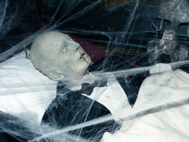
This definately fits the theme. Creepy, Halloween style kind of feel. The shot looks good. The angle and framing/cropping are good. I like how you have placed his head in a corner and the rest falls in a diagonal. The batty thing looks a little out of place, but still fits in with the theme of scary.
Focus and clarity are good. Don't really see a DOF, but having the whole thing in focus is not a bad thing. Especially with this case. I think that the only real complaint from me would be the lighting. Looks like conditions were not ideal for the shot. The brights are maybe a little bright for the "dark spooky" theme, and there is a harsh shadow from one of the strands of cob web near the bottom right. Kind of looks like the conditions were beyond your control, but you tried to make the best of it.
Really didn't do bad, but definately could have been better.
Overall, a nice shot for the challenge.
~Heather~





 Add photograph to your favorites
 Add photographer to your favorites


 Photographer found comment helpful.


