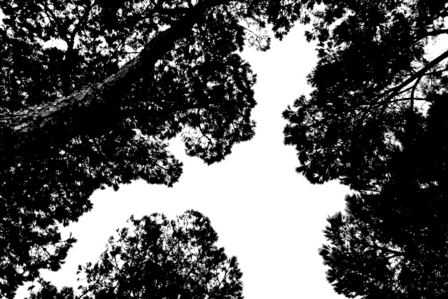
Ok, I get the 'Over my Head' part, but why the "(contrast)"? The photo speaks pretty well for itself. Anyway...I like the feel of this, it's symmetrical in an abstract way if that makes any sense. :D Good luck in the challenge.
There is too much contrast in this photo. The sky is completely blown out, which would be okay if it served to highlight the detail in the trees, but the detail in the trees is completely lost because they are too black. I liked the idea though - it was great for the title.






 Add photograph to your favorites
 Add photographer to your favorites


 Photographer found comment helpful.


