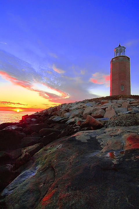
Yikes - Looking at this image now that I have a new monitor for my computer and have since calibrated it really scares me. Boy did I overdo the saturation. LOL! It looked pretty good on my old monitor!
Taken of Steve Brown's favorite lighthouse. I used CS2 to create two copies of same image at two different exposure settings. Used Photomatix Pro to generate HDR JPEG image with tone mapping. In Elements 3.0, adjusted levels, hue/ saturation of individual color bands, adjusted brightness/contrast, resized for web, USM, reduced noise and spot editing in rocks to remove lines generated by HDR conversion.
Statistics
Place: 320 out of 712 Avg (all users): 5.8213 Avg (commenters): 5.8667 Avg (participants): 5.7364 Avg (non-participants): 6.0674 Views since voting: 1245 Views during voting: 448 Votes: 347 Comments: 19 Favorites: 1 (view)
one thing, the LH is too nearer the frame line. composionally almost centered. slightly good work at photoshop. but why deep red line on the left . why?again there is enough space up or down to reduce and raise the impact of the whole scene. better cut from the foreground. make two L-shaped cardboard cutouts and view the pic.moving them up or down,or sideways and make the best of composition of your good photograph.
This seems a little oversharpened (the white halo around the lighthouse). But you lucked out...I'm a sucker for lighthouses and add one extra point from what I would normal score them.
too much saturation. I know dcp members love it, but it does not look real. Saturating a little from the original to give it pop is good, but this is overboard.
NIce sunset glow of light - so real you can smell the salt air. I particularly like the light on the rocks in the foreground. I like the deep blue of the sky - but there seems to be a good bit of noise in the thin clouds at the very top of the frame - probably from boosting the saturation. I wish the red on the lighthouse wasn't so neon bright. The horizon is not quite straight - when I line it up with the edge of the window it is only slightly off, but for some reason it seems more tilted - perhaps the distortion from the lens is adding to the illutsion?






 Add photograph to your favorites
 Add photographer to your favorites

 Photographer found comment helpful.


