Honestly, your name fluttered through my semi-conscious mind while voting this image. Apparantly my skills are not honed enough to instigate a response with 100% accuracy. ;) It will come though, I guarantee it.
I agree with mbardeen. Here is a crop of your photo with some basic adjustments. See the difference? Please do not despair.
My 2cents
Look at the above image that giega put up on your monitor.
Now adjust your monitor until it looks good to you.
This simple step should solve the washed out issue.
I offer this as it seems that consistantly you are nicked for your shots being too light or washed out.
Then I would highly suggest getting your monitor checked. If you are seeing 99% of the images as "too dark", perhaps it is not the images, perhaps it is your monitor?
New monitors cost less than a weeks worth of groceries these days -- perhaps that would be a wise investment.
Hi,
I'm going to offer a critique, though you will probably ignore it. There are certain things you should do whenever you prepare a shot to submit to DPChallenge.
First ask yourself "What is the subject of this shot?"
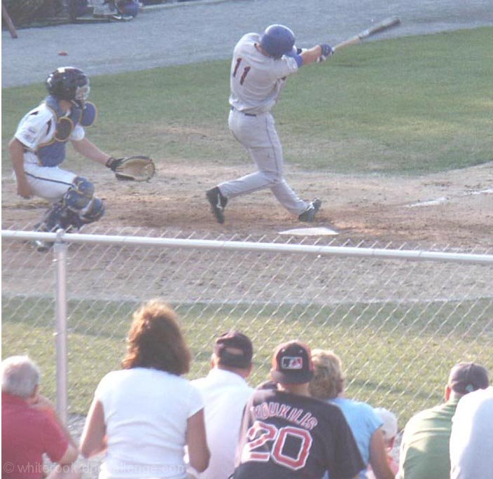
Is it the grass? Is it the chain link fence? Is it the crowd? Is it the ball player. I can't tell. Remember - Simple is good. Too many distractions and the eye wanders. If something is in the photo and it is not the subject, crop it out.
Second: Colours - for a start. Black should be Black. White should be white. Here your black is a form of gray -- that is what people mean when they say "too washed out". Adjusting the contrast (or levels) of this photograph would do a lot to help.
I've taken the liberty of cropping your photo and adjusting the colours so you can see the difference this makes - I hope you are not offended.
Third: Composition - Your ball player is performing some action and your photograph should be telling a story about that action. If I look at this photo, I immediately think that he has struck out. Why? Because you have included the catcher, so I think he's important to the story. But then when I look, I do not see any ball in his hand and I become confused. If you had included more out in front of the ball player and crop out the catcher completely, I suddenly understand he's hit the ball and then the context becomes clear. Now your photo stands alone and tells a story in its own right -- your title only helps to reinforce your photo.
Witness this quick and dirty edit:
Ideally there would be even more space out in front of the player, but this should at least help you see the difference.
Hi,
I'm going to offer a critique, though you will probably ignore it. There are certain things you should do whenever you prepare a shot to submit to DPChallenge.
First ask yourself "What is the subject of this shot?"
Is it the grass? Is it the chain link fence? Is it the crowd? Is it the ball player. I can't tell. Remember - Simple is good. Too many distractions and the eye wanders. If something is in the photo and it is not the subject, crop it out.
Second: Colours - for a start. Black should be Black. White should be white. Here your black is a form of gray -- that is what people mean when they say "too washed out". Adjusting the contrast (or levels) of this photograph would do a lot to help.
I've taken the liberty of cropping your photo and adjusting the colours so you can see the difference this makes - I hope you are not offended.
Third: Composition - Your ball player is performing some action and your photograph should be telling a story about that action. If I look at this photo, I immediately think that he has struck out. Why? Because you have included the catcher, so I think he's important to the story. But then when I look, I do not see any ball in his hand and I become confused. If you had included more out in front of the ball player and crop out the catcher completely, I suddenly understand he's hit the ball and then the context becomes clear. Now your photo stands alone and tells a story in its own right -- your title only helps to reinforce your photo.
Witness this quick and dirty edit:
Ideally there would be even more space out in front of the player, but this should at least help you see the difference.
Wow...I didn't expect this to ribbon on either side of the scale. Still, there is no acounting for taste. Here's to your getting a primary-colored ribbon in 2007.
Why do 44 people think this shot is terrible?
The chain link fence is sharp.
The grass is green.
I don't really see this shot is washout!
Thank for another brown ribbon. Guess I am a point guard for this group!
The 'rookster strikes again! An excellent way to finish out '06... My goal for '07 is to hone my skills to the point where I can spot your entries. Others already can & I envy their obvious talent.
i dont' know if you have any emotional attachment to this image, but it really comes across as a bad snapshot that could use some serious post-processing. after the challenge, you might want to seek out some help in the forums just to see what solutions others might be able to come up with. as it is, though, i imagine this will get rather hammered in the scoring.
needs a boost in contrast and color, or overall it is just to bright and washed out. Might be a good shot to boost the contrast on and convert to black and white.
I'm sure this is a special image to you.
It lacks in contrast overall though, and needs some minor clean-up, sharpening and a touch of noise reducion perhaps. A small crop of a much larger image?
Excellent timing on the shot though. I'll be looking for this after the challenge to read the story behind this.
This would really benefit from a little adjustment from some photographic software. Most digital cameras come with editing software packed in the box. Just clicking on the auto levels would help this image a lot. There is nice action going on here, and you want to show it in nice sharp vivid colors, or black and white with good contrast.
Maybe this would be more significant to me if I kept up with baseball. The big problem with this photo, is that half of it is dedicated to the backs of the people in front of you.
Not much more than a snapshot here, imho. Colors are washed out, the backs of the fans down front don't add anything to the image, and you can't see the batter's face, or even the ball. Move around to the third base sideline next time and get down lower so you capture the batter's face and the fans reaction, and you'll have something to sell on ebay after no. 11 makes it to the Hall of Fame!
way too washed out. white line on the left needs to go. Looks a little late in the swing, and I'd get closer to eleminate the fence. Heard enough? ;-) Keep shooting!
I'm sorry, but this looks as if it were taken with a camera phone. If there was more space above the players and the crowd was cropped off a bit, and if the quality was better and there was more contrast then this would have done much better.
Well he has a nice swing so maybe. I like how you avoided shooting through the fence however it looks like you got hit with some lens flare? The whole image seems really light.






 Add photograph to your favorites
 Add photographer to your favorites


 Photographer found comment helpful.


