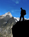
Throughout our Alps trip, we were looking for "hero" shots. This was one of the first. Andrew's looking across Val Ferret at Les Grands Jorasses.
I deliberately took multiple shots with him properly exposed vs. the mountain, intending to join them in post processing. But when I did, it ended up creating low contrast between Andrew and the rock he's on and the big mountains behind.
So instead, I just adjusted a single image. After checking with the SC, I learned that going completely black in the silhouette would've risked a DQ, so I left in a little detail. Interestingly, on my CRT I can barely see any detail in the silhouette, but on my LCD the shadows are so bright I think the shot loses a lot of the impact.
I was taking some shots in the shadows that morning and forgot to reduce ISO from 200 to 50, so ended up having to use some noise reduction in the sky. Other editing included sharpening and various curves in different portions of the image, and cloning out a small tuft of grass on the foreground rock.
Post-challenge: yep, it definitely lost some impact for not being a pure black silhouette. On the other hand, several commenters wanted more of him visible. So the split camps had an effect. I have to admit I'm surprised and disappointed that this didn't score better, but then again, the voters regularly surprise me.
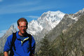
Here's how it looks with a pure black silhouette:
Statistics
Place: 306 out of 712 Avg (all users): 5.8525 Avg (commenters): 6.3750 Avg (participants): 5.7891 Avg (non-participants): 6.0482 Views since voting: 1163 Views during voting: 460 Votes: 339 Comments: 22 Favorites: 0
Beautiful shot! I get dizzy just looking at shots with people this close to the edge :) I think it's very well done...with the idea of the silhouette. It appeared all black to me until I went back to really look...and I don't think that's a big deal. I love how you have the bright colors, and yet the subject is really the silhouette. I also like his stance / pose. Nicely seen and photographed.
Those clouds are very cool, similiar to the Aurora. The overall composition of this is terrific. A good showcase of near/middle/far or triangles (whatever you want to call it). It really helps with the eye movement. I like the detail here and the nice lighting in the background mountain. I love the pose of the hiker, though I don't like how he is very dark. Fill light would have brought this to the next level or going the opposite pure silhoutte. Still a great capture.
I totally agree with Catherine! it would look excellent on a travel magazine cover. I really envy you:) in a good way. I'd love to walk in the Alps some day!
Jeffrey,
I immediately thought "Outside Magazine cover" when I saw this during voting. I'm surprised you didn't break 6 with this one, and think you should consider submitting to a couple outdoor type publications.
I definitely prefer it without it being completely black. And I love the contrast and perspective too.
edit: And I meant to say that I just LOVE the vibrant blue color.
i can't help but wonder how this would have looked had you use a little fill-flash on the subject. as a silhouette, i think it would have been stronger with a different pose, definitely not looking at the camera.
fantastic location, unfortunately that man and foreground rock are underexposed, some camera tuning and postprocessing could pull detauls out and it would become a great photo
Reminds me a lot of Galen Rowell's work (who happens to be my favorite photographer). Great color saturation & excellent symmetry. My only slight criticism who be that since the climber is in silhouette (which I really like) it would have been better if he (she?) were looking out over the over look, and thus getting their facial features in silhouette. Great image ~ 8.






 Add photograph to your favorites
 Add photographer to your favorites


 Photographer found comment helpful.


