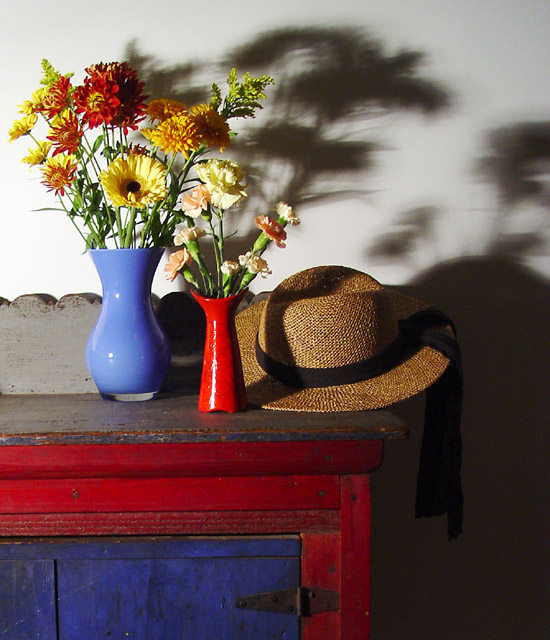
I adore the colors, the flowers, the composition, and that gorgeous piece of furniture. I don't like the stark shadows behind the objects, though -- I find them distracting. I imagine you loved those, so I'll chalk it up to personal taste. :)
Seems like more than a duotone, but I like the items you chose and the way you arranged them. There is a great variety of textures from soft to smooth to rough in the items, the flower shadows, and the noisy hutch shadow, making it fun to "explore" the image.
The hutch is such a great piece and I really like the colors and textures of it.....think you might have lost the smaller red vase and flowers as it seems lost and in the way causing a distracting shadow on the hat. I like the hat as well. I am a BIG fan of shadows and I like these shadows as shadows but not as part of this image. Losing the red vase and its shadows would also help this. Placing the blue vase flowers closer to the hat and shoting just slightly more to your left might have helped too....The BG color does not work for this, though I realize there may not have been much you could do about that.
I wish you could bring out the texture and color of that wooden table/shelf more- it' makes a great contrast with the sleeker-looking vase, flowers, shadows, and hat.
i like the color and composition. lighting could be worked on. i'd try to make it more even and avoid the shadows on the wall. they distract from the subjects
I like the color combination, and even the shadows on the large flowers, but don't like the dark area on the right. Cropping the picture on the right rim of the hat would have been better in my opinion.
I like the colors and the composition. The shadows are a little too harsh for my taste and become a distracting element in the image. Some softer light could have helped this.






 Add photograph to your favorites
 Add photographer to your favorites


 Photographer found comment helpful.


