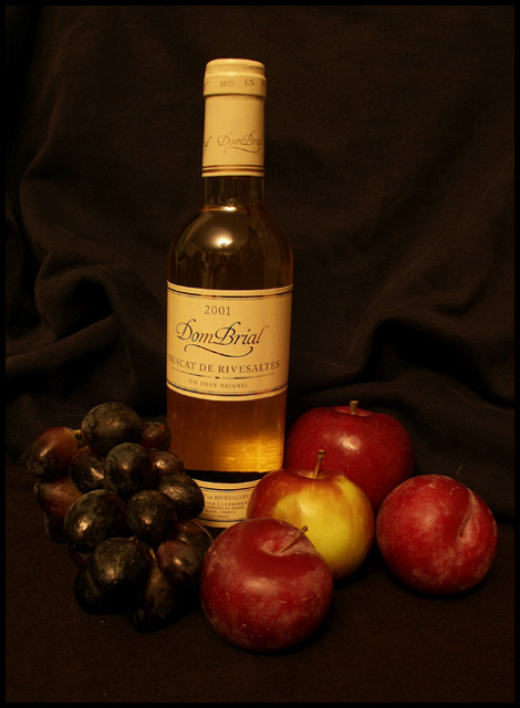
Why is this picture so structured and confining? Since when do grape vines and apple trees follow such harsh guidelines? Let your subjects flow more, breathe more. And sticking with the red/dark violet/brown color scheme, white wine was definitely the wrong choice.
Nice composition and contrasting background; might've benefited from slight rotation and cropping to set bottle in more vertical position - it leans a bit.
That’s a good still life. I would have liked it better if it didn’t have the yellow hue. Although, you’ll probably get a lot of people that will like the warm tones. Personal preference I guess.
Unlike many, this is a real still life shot. The background would add more interest to the image if it were colored, like blue or green. and if you had more interesting lighting. Focus seems a little to soft for how it is set up.
this needs a third level to create a geometric. the apples or grapes on the floor, the bottle is tall.. something in the middle.. maybe elevate one of the groups or some of the fruit. Also, the bottle seems a bit tilted to me (to the right).
I like the lighting.. gives a warm and inviting feeling.





 Add photograph to your favorites
 Add photographer to your favorites


