Mate, you are brilliant. Just found your portfolio and it's fantastic. Really looking forward to seeing more of your work, although you are going to have to go some way to top that Cape Cod photo!!
Genius entry once again, and your 8th brown ribbon in 13 total entries (but who's counting such things)! You're on a roll again, but it will be tough to beat that four in a row record from last fall. Thanks for the delightful sense of humor you bring to DPC!
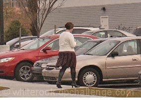
the reaon i gave this a bad score is that, its just some random shot of some lady wlking down the street, no thaught went into this photo and its a fuzzy shot.
this is an interesting idea, but it could be improved in a few ways. the main probelm is the size and resolution of the image. i realise this may be unavoidable, depending on the equipment you hav to work with, but if you bumped up the resolution in your camera, this would greatly improve the shot.
the rest of what i'm going to say is really hypothetical, if the resolution were better.croppig closer to the woman, so bring the viewrs gazemore immediately to her would certainly help, as at the moment she is rather lost in the background.
To me, this seems like just a quick snapshot. Perhaps if you had zoomed in closer, cropping out the front end of the cars and focusing more on her, it would be more effective for me visually.
I wonder how many comments you have saying that this is too small? I'm guessing more than 10. It's a bit small. There's a good tutorial on resizing images in the Learn - tutorials menu of this site. Is it a mobile phone image?
Aside from it being too small, I guess improvements that you could look at are -
Framing - dead centre subject lack energy.
Background / composition - pretty cluttered, distracts from your subject
Subject - not really prominant enough, the woman is tiny really.
feels very much like a snapshot to me. You should also try and get your photos up to the full size for better scores. Here is a tutorial you may find useful on getting images ready for challenges.
This image was too small for me to seriously judge; I liked the use of the non-traditional model, but the image itself, with the model centered, the very busy background, and the bits that are out of focus, didn't help.
Please realize this is meant to clarify why lots of other people are going to vote poorly on this, and that my intent is to inform (instead of berate / belittle).
Image too small, OOF, too much clutter, distracting elements, lack of detail/clarity, border on only one edge... thank you for participating, and I'm sure she is a lovely woman - if this is someone you are close to, then none of this matters much anyway ;)
When it comes to brown ribbons... ask and ye shall receive. Seriously, was this taken on a cell phone? I don't mean to be harsh or rude, but this is one of the worst entries I've seen. I really hope its an attempt by one of the site masters to secure themselves a last place to round out their ribbon count...






 Add photograph to your favorites
 Add photographer to your favorites


 Photographer found comment helpful.


