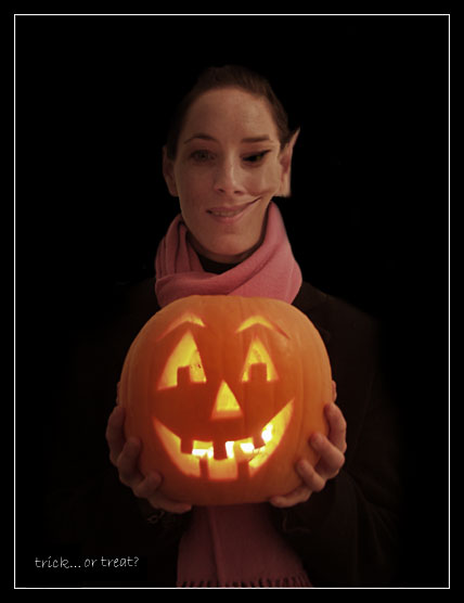
Compositionally, I like the balance between the pumpkin and the model. I also like the background "surrounding" them, as it gives the feeling that they are being "swallowed" into the picture. The pink scarf also helps to differentiate the pumpkin from your model, and adds some color to the shot.
I think if the focus on the pumpkin had been sharper, it would have had more punch. Also, like someone mentioned, since you "distorted" her face, it may have been a nice touch to distort the pumpkins as well. I think using that same effect on the opposite side of the pumpkin would work well. That said, the effect does little to endear me to the picture. I think it would have been as strong, if not stronger with that effect added.
If you have any questions or comments, please feel free to contact me.
That looks like it would hurt! HOW DID SHE DO THAT? LOL! Nice idea, good concept but the PS on the right side really hurts the shot to me, her left ear almost looks vulcan without playing with it and the arch of her eyebrow is very natural and would have worked very well. If you had left the right side alone this would have been a 9 or 10 for me before I was done, as is, a 7
I think this shot would be much better without the distortion to the girls face, and it would still meet the challenge. The distortion just distracts from the rest of the rest of the image...I like the text on the bottom, the border also works well with this shot.





 Add photograph to your favorites
 Add photographer to your favorites


