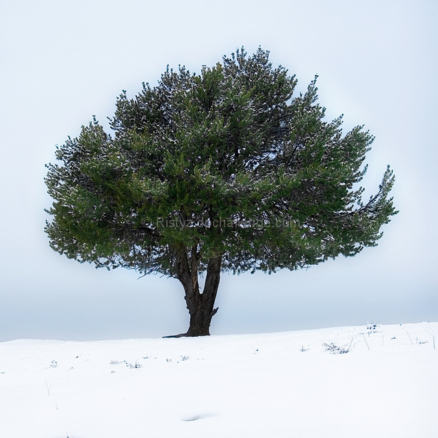
I gave this a 7. Really liked it, but 'nit picked' at the time of voting that a 'fraction' off on the right to get it 'visually' more centered/balanced, likely have made it even better. Didn't mind the blown snow too much. The only other thing was just a more refined crop at the bottom, but minor.
I like the fact that you've chosen a square framing - always makes the centre point stronger: however, it also emphasises the geometry of composition, and the tilted line of the horizon - I know, it's a slope, it should be tilted - seems out of place in this format. Good thinking otherwise, though.






 Add photograph to your favorites
 Add photographer to your favorites

 Photographer found comment helpful.


