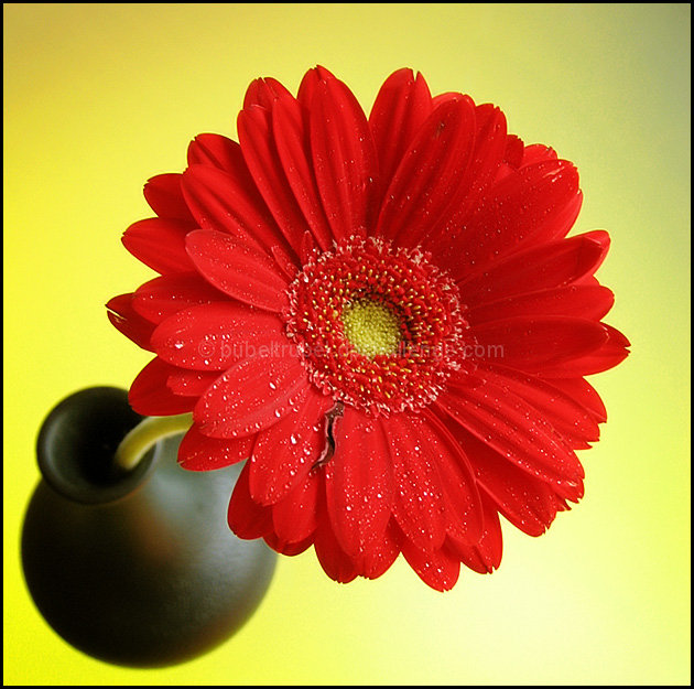
Really nice treatment of the colours, and the positioning of flower versus vase provides tension. Red flowers are hard to photograph, and this is well done too, showing just enough variation to offset the smooth blurred vase.
The little black (dying petal?) on the bottom is a bit distracting. I think, in this case, the bright white water droplets are distracting as well because they're in stark contrast to the red of the flower.
Nice .. I think I like your version better than mine because the colours contrast nicer and the flower head is fuller .. //www.dpchallenge.com/image.php?IMAGE_ID=269911





 Add photograph to your favorites
 Add photographer to your favorites

 Photographer found comment helpful.


