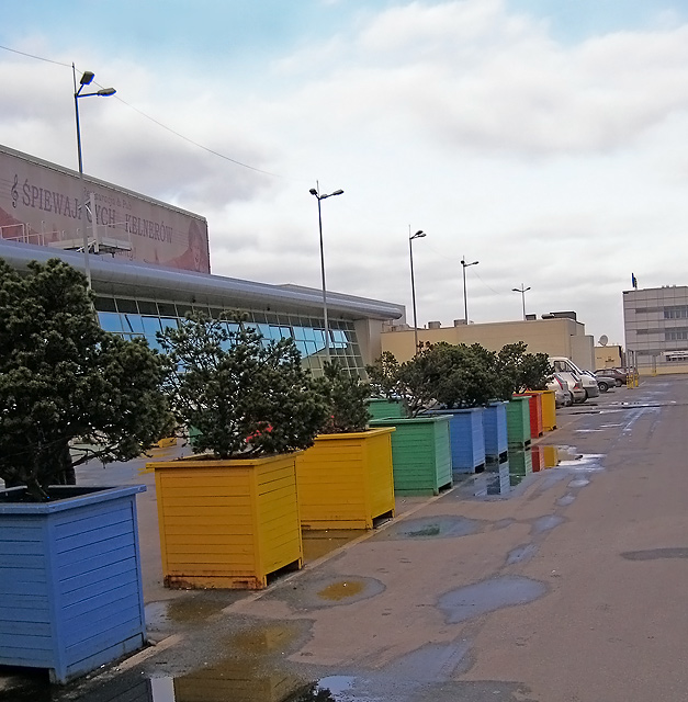
For me, I think a different angle or viewpoint would make your image more interesting. Perhaps also cropping it tighter on the right hand side to eliminate the building in the background.
The subject matter here really didn't fit the challenge for me, and wasn't particularly interesting to me. Actually, the arrangement itself is somewhat garish (blue, two yellows, green, two blues); nothing holds the whole thing together, and the cars at the end of the row are an unnecessary distraction (I would have cropped them out and ended the shot there).
This picture actually has some good potential. I think the angle will need to be a little more dramatic and the utility items surrounding the boxes should be hidden from the image all together.




 Add photograph to your favorites
 Add photographer to your favorites


 Photographer found comment helpful.


