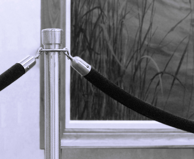
Simple is good but here, the composition doesn't work for you. The picture frame is directly behind the bar. When things are stacked directly on top of each other, visually, the eye is annoyed.
Very interesting comp. I might have scooted the post over a little to the right, though (into the darkness of the background art piece). Desat works well.
Subject matter here was not particularly interesting to me, and while suitably shot, there's nothing special or different about the appearance of objects with which we're all familiar.
pole should have been positioned slightly to the left of the background picture and against the plain wall. positioning it in front of the picture frame leads to a poor composition.





 Add photograph to your favorites
 Add photographer to your favorites


 Photographer found comment helpful.


