|
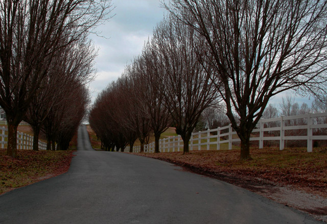
This is nice composition, but the colors are far too drab to make it a striking piece of work. A bit of saturation could bring out the greens and whites and blues a lot more. A tad of enhanced contrast might make those trees and the fences really "pop" out more, too. |





 Add photograph to your favorites
 Add photographer to your favorites


 Photographer found comment helpful.

