Author Thread
Post actions
You're quite the anti-fashionista. I think I am going to become a fan... ;-)
Post actions
I called it! I gave you a 10 just to mix it up. :) Cheers mate.
Message edited by author 2007-01-15 14:24:05.
Comments Made During the Challenge
Post actions
I do not care for the PP personally.....good example, though.
Post actions
for my monitor the contrast is too high, but it meets the challenge
Post actions
the coloring of this does nothing to help it.
Post actions
the light in this one isn't right at all.
Post actions
I like the idea and the treatment generally, but to me it seems a bit too much. I think it could have had more impact if the treatment was pulled back a bit.
Post actions
Great idea but the post edit is not working for me.
Post actions
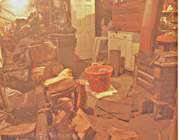
This has whiterook written all over it. I'd offer my opinion of the pic but i'll just agree with the rest of your commentators. It is shockingly messy!
Post actions
I think I know who took this... is it another instant classic by White Rook? excellent 'dusty' appearance for the basement photo.
Post actions
Leave all as it is, but get a better camera or improve lighting - the noise and colour are really strange
Post actions
I'm really not sure about this effect. I mean it makes it look dusty and that, but is kinda strange looking.
Post actions
Could have been a very good picture for this challenge - but apparently you decided to ruin it...
Post actions
the graininess may be the point to make it look worse, but I really don't like this treatment for the photo
Post actions
The lighting on this shot really needs to be adjusted. I don't know if it was done for effect, but the grainyness really isn't needed on this shot.
Post actions
My garage looks like this!
Post actions
Quite dreadful - so over lightened with no depth of blacks whatsoever. Add in the white bar image right and this just seems like a joke.
Post actions
Very noise and the light looks weird here.
Post actions
To my eyes, there isn't a whole lot to redeem this image. The scene is not particularily attractive, the composition is centred and without much charm, the colours are very muted, and there's a lot of noise. ~2
Post actions
Post actions
noisy, overexposed. but nice idea :)
Post actions
nice idea... less nice realisation
Post actions
Don't understand the lack of color or contrast ... is that intentional?
Post actions
personally, I don't care for the processing here ...
Post actions
The lighting of this image is very unattractive to me. It feels as though it's a low-res scanned Poloroid that was cropped too wide(hence the white strip on the right of the image). I think some darkening and contrast, maybe some noise removal, could have really salvaged this image.
Post actions
I can see the noise and grain might be adding to the atmosphere, but it doesn't work for me.
Post actions
Post actions
Ouch! The quality of this picture is really suffering!
Post actions
I don't care for the overall editing effect used.
Post actions
Not sure why it was over processed.... but good idea for the challenge
Post actions
looks like my room, but quality+lighting+focus+composition brings my vote down
Post actions
Whoa not good sorry but does meet challenge
Post actions
Okay, I get the connection to the challenge. But the image is really washed out.
Post actions
the edit is horrible...washed out and poor ... sorry :-(







 Add photograph to your favorites
 Add photographer to your favorites

 Photographer found comment helpful.


