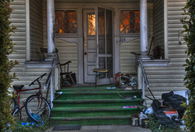
The red and blue stuff lying around on the ground takes focus from the center, I think the door would get much more focus if those things weren't as saturated. I love the light from the inside.
There's something about your post processing that makes this image very appealing, in spite of the decided lack of curb appeal at No. 215. The glowing colors reflected in the windows really draw me in.
Creative, very. I'm conflicted about the tree borders. I like how the photo is not "pretty." Title is perfect. It draws interest into the shot, as it is not immediatly relevant to the viewer. Possibly over worked in PP. still nice. 8







 Add photograph to your favorites
 Add photographer to your favorites


 Photographer found comment helpful.


