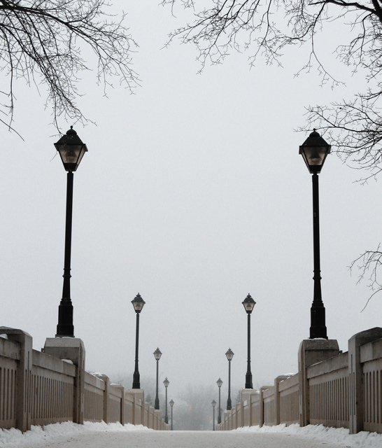
I really like this photo. I love the wintery feel, and the perspective of looking across that bridge with those great lamp posts. I could see this printed and hanging on a wall. Great work.
One of the best I've seen lately. Don't change anything! (The "too much in the middle" must have been a typo - leaving out "space," but that rather spoils the delightfulness of the comment).
I like the bridge, and if there were something interesting in the sky, the trees would make a nice border together with the bridge. But lacking that something, I'd suggest cropping this lower to lose the trees and some blank space.
I can see what you were tying to do. Get bridge at the bottom, tree at the top, but somehow there is too much in the middle. I don't know if one could change this with a different angle. I am sure you have tried. 6
One of my favorites in this challenge. Superb composition. The only small suggestion (which doesn't affect my rating) would be to experiment with the removal of the tree branches to see if it makes the lamp posts that much more striking. I really can't decide how I would like it better, though.





 Add photograph to your favorites
 Add photographer to your favorites

 Photographer found comment helpful.


