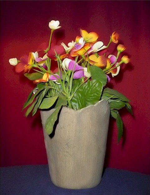
I took this right in my home on a small round table, using my lamp as the light to take this still life. This flower vase sits on my table, and now it has come to good use to my camera. The background is actually the curtain from my window behind it.
Statistics
Place: 176 out of 326 Avg (all users): 4.9107 Avg (commenters): 5.4444 Avg (participants): 4.9535 Avg (non-participants): 4.8526 Views since voting: 940 Votes: 224 Comments: 12 Favorites: 0
In general, I find your photo nice and pleasant. But I am sure you want to know why it didn't do better. Don't we all? At first, I have to tell you that I love the texture of this vase. It catches the eye. This is good. What is not so good is the fact that you have tried so hard to distract my eye from its beauty by placing the flowers there. Kidding. But I wish you took away a few of the flowers. The pink ones. A darker background would have done better. Or anyway, a contrasting background. Red flowers on red background... You have to be a genius in lighting or you have to get lucky. I got lucky one time with a red subject on a red background. You also got a nasty pixelation on the curtain you used as background. When you try to enhance a photo in Photoshop, watch the negative effects you might get. Another thing, when you use silk flowers, make sure you don't have fallen flowers, empty steams, like you have on the right just above the vase. Not unless you intend the effect, you have something to say by that.
For your first submission I think you did wonderful. Keep trying. You will only get better.
I like the colorful flowers coming out of the gray vase. Would be cool if it were all agaisnst a dark, nuetral background - the red hides some of the flowers and you;ve pushed the saturation or the sharpenning a bit much - see the grainy effect in the red? Perhaps a light behind the vase would help highlight the edges of the flowers an differentiate them from the red background.
Too many colors. When you come across a scene where the colors don't ALL complement each other, go with black and white. Even if you're inexperienced with black and white, you're gonna get a better picture than with color.
This pix has me going since not too crazy about florals , but the lightnings is ok, the vase could be further away from the background, the colors work, and the texture of the vase come through. it is the I don't give a "flying" how you jammed in the flowers that takes away from the picture
Nice still life. I only have a couple complaints. I don’t like how the background got all pixilated and I don’t like the harsh light on the center leaf. Also, the flower arrangement is lacking a little something in the front center.
The colors are nice as is this lighting....the vastness of the vase, however, overwhelms the flowers and the entire image....something smaller and would have been better, perhaps, although its color is fine.
This coule be a better picture if the background didn't look so pixelated
The blue surface isn't straight, looks sloppy
the flower look pretty and have a nice soft edge to them
The "classical" still life... The background colour could be a better one, or just the PS distracts me in the upper part of the photo. :( But good idea, and right to the topic of the challenge..





 Add photograph to your favorites
 Add photographer to your favorites


