Initially inspired by Maria Cristina Cassenelli in the book "Still life and special effects photography" to make an image with mostly white tints, but after some experimenting it turned out to be a very different image after all.
At first I wanted to achieve an image with all white tints and made the setup for that.
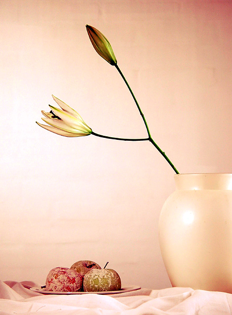
White lilies in a white vase, leaves removed because the green was too strong and the shape of the leaves too distracting. Apples on a white plate covered in flower to remove some color.
White curtains covering the wooden table. White wall as background.
Lit by a small 60W halogen desk lamp from the left, lighting the apples and vase. A 150W halogen floodlight for the white wall at the back. A 500W halogen floodlight bounced against white curtains on the right.
Turned out a nice image, but then I applied auto levels and color balance and I got these lovely soft colors, so decided to stick with that. Finally I also applied a light unsharp mask.
I am not satisfied with the background, one can see some uneven spots. I tried to move the scene further away from the wall but that did not help sufficiently. A smart blur would solve it, but is against DPC rules.
Statistics
Place: 16 out of 326 Avg (all users): 6.3363 Avg (commenters): 6.9167 Avg (participants): 6.2756 Avg (non-participants): 6.4167 Views since voting: 1937 Votes: 223 Comments: 16 Favorites: 2 (view)
I love the lighting and the composition on this shot. The open flower looks like it is lit from inside, good effect. The only thing that really distracts for me is the stuff on the apples.
well....a darker draping material, better draped at the bottom would have provided better contrast for this but the vase and flowers are just too overpowering and I had to scoll all the way down to see the maint title subject.....the background might have also been a different color as it blends a bit too much with the vase....now if you lost from the apples on down by cropping, this would be a much better, minimalist still life even without the aforementioned suggested background change.
weird apples. i like the forms and lines. even the uniform color scheme is nice. although the vase blends in almost a little too well with the wall... maybe you could use shadows to separate the vase, table, and wall a little more. actually i think the vase and flower alone would make a nice shot... or a different shot using the apples without the flower.. focusing more on the folds in the fabric and the texture on the apples.





 Add photograph to your favorites
 Add photographer to your favorites


 Photographer found comment helpful.


