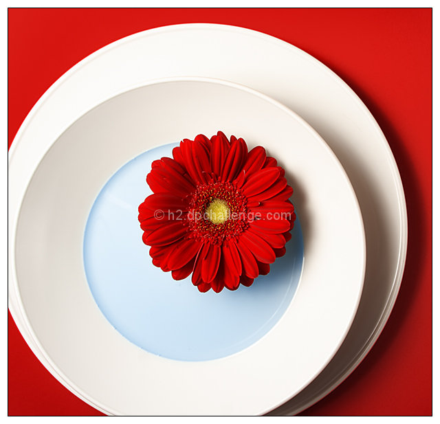
Gerber sticked onto the plate with some play-doh, filled with window-cleaning liquid.
To me one of the most beautiful images I ever made. Still afraid, voters will "dnmc", 'cause the plates are not in the center (though the flower is perfectly centered). So I'm hoping for a 6.8ish score.
Editing: not much - levels, hue/sat for reds and yellows, selective color for blues, cyans and whites. Some dodging and burning of the background to correct the uneven lighting (one flash with umbrella from left, small reflector from top right), cloned out an unwanted refection. Resize, USM, NeatImage, border added.
-----
Wow, way better than I expected. Thankies for all the nice comments and votes!
Statistics
Place: 2 out of 415 Avg (all users): 7.2028 Avg (commenters): 8.0455 Avg (participants): 6.9882 Avg (non-participants): 7.3465 Views since voting: 10959 Views during voting: 346 Votes: 212 Comments: 65 Favorites: 65 (view)
This is a very striking image. Love the colors and shapes in this photo. The white hues of the plate really complement and make the red shades bolder and vibrant. Love how you have a three-tiered circle shape stacked up - the white plate, the white bowl and then the red flower. These three circles are stacked within a square format photo - the square format works here because not only does it introduce another shape but it keeps the eye squarely & tightly focused on the main subjects of the photograph. Well done!
So i just ran across this picture again and remembered how awesome I thought it was before and I just wanted to finally put down a comment that I adore the crisp colors and excellent composition here. Fantastic photo I gave it a 10
things i love:
_ non-concentric circles
_ centering of the flower, but not really
_ the decidedly RED nature of the photo, fore and background
_ the use of blue in contrast
it looks meticulously constructed and beautifully lit, and i'm floored by the amount of depth and vibrancy that the shadows give this image.
things i hate:
_ don't have it hanging on my wall.
/sorry to gush, i'm a newbie and this has inspired me.
not centering the plates was truly a stroke of genius. i have no idea why i love it, but i do. i don't think I would have ever thought of that. amazing shot!
Very nice graphic art photograph, congratulations on winning the red ribbon! If you're going to coordinate your ribbons with the colors in your photo, you might want to photograph something blue next time.
no, already got the blue with a brown shot - I still need a yellow one (so rate all yellow shots high in the near future)
Very nice graphic art photograph, congratulations on winning the red ribbon! If you're going to coordinate your ribbons with the colors in your photo, you might want to photograph something blue next time.
That's cool! You got away with it (re: my earlier comment). A vicarious thrill for me :-) Here's the one of the ones I was referring to, that fared nowhere near as well:
Congrats on ribbon!
Thanks, Bear. Besides I've never seen that, there's a lot of difference, isn't it?
That's cool! You got away with it (re: my earlier comment). A vicarious thrill for me :-) Here's the one of the ones I was referring to, that fared nowhere near as well:
Gorgeous lighting and colour. I love how the flower is centered while the dishes aren't. It really helps throw your centered composition "off" a little and makes it very pleasing to the eye. Fabulous image.





 Pool Position
 Add photograph to your favorites
 Add photographer to your favorites

 Photographer found comment helpful.


