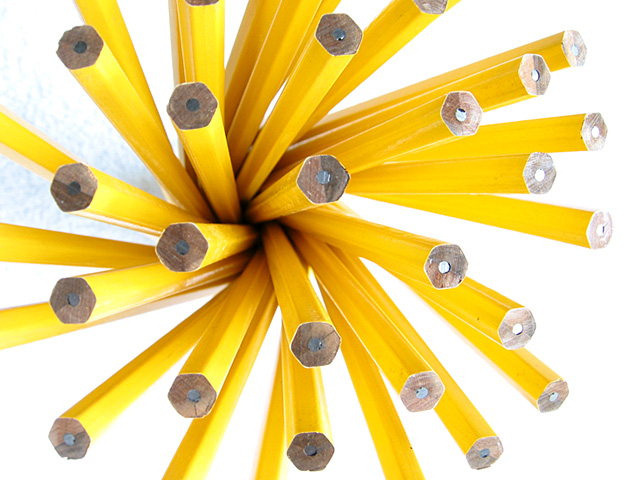
As always, I took many shots from different angles and with different focal lengths and finally picked this one. I also intentionally over-exposed the shot to give it a more bright, happy feel since the subject matter is so ordinary and also because the pencil ends would otherwise be too dark.
Statistics
Place: 6 out of 168 Avg (all users): 6.6308 Avg (commenters): 7.8235 Avg (participants): 6.6032 Avg (non-participants): 6.6567 Views since voting: 2151 Votes: 260 Comments: 55 Favorites: 3 (view)
this has the beginnings of a great shot. nice composition and i love the pattern. the lighting is a bit harsh and the bluish background area in the upper left corner really detracts from the overall feeling. i know it can be very hard to get a solid white background, though, so you did a pretty good job. good work.
I like this shot a lot, but I'm not sure I agree with your decision to overexpose it, I would have taken it down maybe 1/3-2/3, but that's just me. Nice composition and twist (no pun intended) on the challenge = )
Congrats to a very nice photo and my condolences that you shot this photo one week too early ;-) The lighting would be better if not only coming from the right side. There is a strange shadow in the background. Maybe a lamp illuminating the left side would have helped. I like the DOF. -stephan
ouch...i bet you wish you'd held off on this one! great idea...new. it's a little blown out on the right and i can see texture on the left. I would like to see the entire 'bouquet' been in the frame. Great job
Very cool arrangement. The background blowout seems like a good idea, but it did hurt one pencil (one of the cropped pencils in cropped at the bottom seems blurred, I think due to the blowout thing). Speaking of cropping, this would have been a good subject for a square frame instead of rectangle. One side in four shows all of the pencils to the tips, three others do not, to me, this is less than fully eye pleasing. Even so, this idea was very clever and well presented, so I am still going to award you an 8. (don't you wish you'd have held this shot for next week?) Swash
I like this style of photography, so that's a bonus already :) Both the composition and colors are very attractive. At first sight, I thought the right part was to bright, but on second sight I think it isn't. If it wasn't for that brightness, the overall photo probably would look to flat.
I bet you are kicking yourself now for not waiting another week with this nicely done photo. The colors are nice, the connection to the challenge is there....Love the title.
I can't fault this picture, and next week I'd score it ten (really mean that). But I can't see the challenge connection – new pencils, new work of art perhaps. I really like it, I'll give the benefit of doubt score (8)
Something new. Composition - quite good Technical Aspects - quite good, right side a tad bright Meets Challenge - yes Visual Impact / Originality – quite good Jim msp
Very Nice Photo! I liked this shot immediataly but wonder how it would look with a blue background given the contrast between the two colors. Just a thought.
Very interesting. Bet you wished you'd saved this one for this week. Focus looks good. Lighting is good. Subject matter is good. Presentation is good. 7
I really like this...to bad you didn't know the pencil challenge was comming up! I whish it were centered, though...or perhaps that was the effect you were going for? Regardless, its cool good job!
Very cool idea and wonderfully graphic. And my favourite colour is YELLOW! The left and right side aren't balanced, I find I want to move over to the left a bit. 7, Kavey
Well, lemme just start by saying that I guess yer wondering "WHY ME!"... lol.. this would have been a very nice photo for the next challenge... But I guess you have already heard that and will continue to hear it throughout this challenge :) I'm giving this photo a 10 purely on its creativity. This image creates a tough lighting situation, but you seem to have managed that fairly well. The lighting coming in from the right side is a little harsh and the shadow on the left side looks a little strange... Your depth of field is excellent, as is the overall composition... At least you don't have to go shopping before you do the next challenge :) Great shot.. I hope I see this one as a high scoring finisher this week :) - jmsetzler
Can I swap eyes and artistic talent with you? The most impressive thing to me in this picture is the symmetry in this picture. The bluish background in the upper left throws that off a bit.
Too bad we didn't know that this week is "Pencils." I think you would have won.
Great job, and you already have a jump for this week! (bet you won't hear that much :-)) Compositionally, think it should be framed more to teh left, so that there is negative space on the right. That might make it look a little less overexposed as well. karmat
Works very well for this challenge, and would have worked even better for the next. When you do the final work of this you may want to spot edit out what I am assuming is what is left of a shadow after photoshop in the upper left. --10 Agamemnon
Bet you wish you would have known about the pencil challenge ahead of time. I love this photo though. Definately depicts new. Tried some pencil pics myself and couldn't get anything appealing to the eye. You captured it perfectly. What's the blueish color in the top left corner? Shadow? Either way, high remarks from me. Congrats and good luck.





 Add photograph to your favorites
 Add photographer to your favorites


