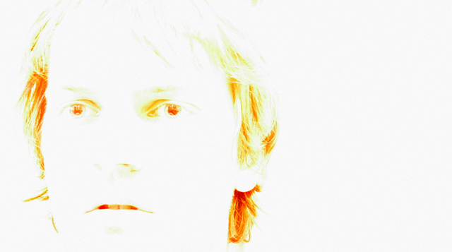
I did not vote this challenge. but for the record this would have been a three from me. the color,and light seem way to harsh. the framing with the extra space to the right of the model is also very distracting. because the image is so over exposed it is hard to tell where the Models eyes are focused...they almost seem to be "Wall eyed" detail is lacking.
I'm not seeing how this photograph fits into the 'grace' challenge... There is a bit too much light for my taste, although I know that was the intention. The composition is good for a self-portrait.
I love the simpleness of this photo. There's a little speck of yellow right at the top of his head that I wish wasn't there, but I'm just being picky. Great job.
God's grace does bring light to our lives... I can see a connection. Interesting. How did you do that? I don't know enough about the editing programs to know how to do this. Unusual and creative.
Interesting photo, and well done, but nothing here says "grace" to me at all, sorry. If you care to explain it to me, as maybe I missed your point, I can rescore.





 Add photograph to your favorites
 Add photographer to your favorites

 Photographer found comment helpful.


