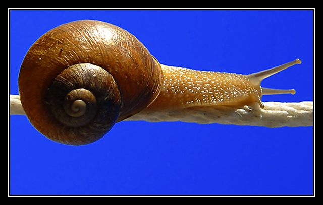
Interesting take on the challenge. The only thing I'm not sure about is the placement of the subject, I think I might like it a little bit lower in the shot. Otherwise, great job.
The smooth background and the edge of the shell, especially on the left, make it look as if the snail is copied into the background. Could also be effect of oversharpening. Nevertheless a good image, good colors, pinsharp, and graceful.
I find the border particularly unpleasant to the extent that it does lessen my enjoyment of the image.
Ignoring it for the moment I like the image quite a lot - the simplicity and the studio rather than natural background works well. In terms of composition I'd like a touch more space above and less below.
What a shot! I don't like the hot spot on the shell, but everything else is so nice, I'm not counting that against you! Nice contrast against the background.





 Add photograph to your favorites
 Add photographer to your favorites


 Photographer found comment helpful.


