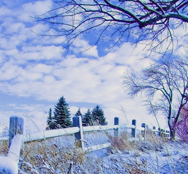
A cool fence at the BYU-Idaho Arboretum in Rexburg, Idaho. PP included a crop, rotate, increase midtone contrast, duplicate layer, increase saturation, median noise at 10 pixels, Color layers to blend the two, decrease opacity of top layer, and flatten. Small cloning of clouds to remove telephone poles, a car, and the top of a building in the background.
Statistics
Place: 170 out of 315 Avg (all users): 5.3414 Avg (commenters): 5.4348 Avg (participants): 5.4639 Avg (non-participants): 5.2632 Views since voting: 1006 Views during voting: 338 Votes: 249 Comments: 26 Favorites: 0
This one has wonderful composition, which I think is it's strong point. The angle of the fence, the forground grasses and the trees in the background all work together well. The tones and brightness are very distracting to me. I would like to see this one re-editing for a more subtle, less blue effect and some darker tones.
This looks very washed out or over exposed. a lot of detail had been lost in the lighter areas. It's also too blue overall. Which works for some photographers on this site but is hard to pull off. I think when going with overall blues you want Darkers blue tones, the lighter ones aren't as asthetically pleasing.
I'm not sure what to make of this one. It lacks any deep colours, which gives it a weird look almost like a painting. On the other hand, I really like the way that looks. 7.
Way over saturated... and what was potentially a good image is ruined. You might consider looking at future images on different monitors, since it could be that your monitor is not calibrated properly.
Nice picture but I dislike the colors, sorry about that, there´s something wrong with the balance between cyan and magenta (or red and blue), I´ll give you 4 for a good choice of location. good luck
While I'm not entirely a fan of the processing, I do have to say it gives this a cold but magical look. So in this case, the more I look at it, the more I think I like it.
A super composition, but I am really not keen on the blue colour caste (not sure if this is a white balance issue or a deliberate postprocessing decision, but either way, doesn't work for me). None the less, a 6.
The blue overtones to everything here did not work for me; was the snow really blue to the naked eye? Was the tree/bush on the right really purple? The pastel effect was just a bit too much for me to take.





 Add photograph to your favorites
 Add photographer to your favorites

 Photographer found comment helpful.


