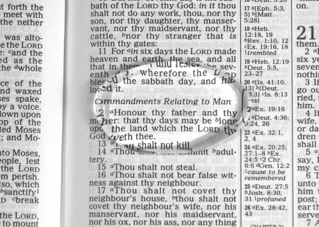
Guidelines? Gracious? I'll try to avoid a theological debate... Lots could have been done to improve this, starting with center the magnifying glass better. Lighting, angle, perspective - it's just all pretty standard. It needs some more effort.
Unfortunately, I don't find this image too outstanding. I don't think text, in general, goes over too well here. I myself rate these types of images lower because I don't feel the shots are very challenging.
I like this version of a bible shot...the magnifying glass is an excellent touch as is including the binding. Centering works well in this instance, nice job.





 Add photograph to your favorites
 Add photographer to your favorites


 Photographer found comment helpful.


