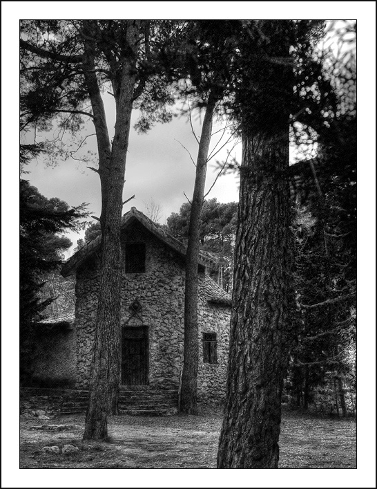
The whiter section of sky between tree 2 and 3 is distracting, kinda like you missed a spot. I wish the house was just a tad lighter too. Love the composition and conversion to B/W.
Pretty good work - like the sense of grain and tonality. Composition is very strong, the progression of those trees leading the eye through to the house.
I'm not docking the score for it, but I think the wide white border hurts this image. The image itself is excellent. I like the tones, the textures, and the composition.






 Add photograph to your favorites
 Add photographer to your favorites


 Photographer found comment helpful.


