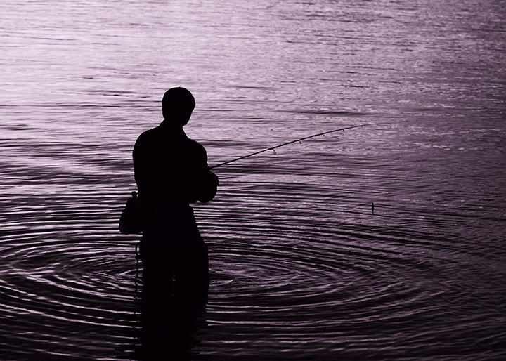
7 - Nice tones and ripple capture. Could just be the perspective, but a nudge up on the right to 'straighten' may have made this even better in my opinion. Difficult, but just a touch more depth/drama/contrast too perhaps.
I like. Not wholly sold on the metal tonality, as i think it might have been interesting enough in simple black and white: likewise I wonder if you might not have made more of the shapes and patterns within the water. A fine contemplative study nevertheless.
This is a fine shot. I rate it a 4 not because it's a weak composition, but simply because the wide array of approaches in this Free Study compel me to put this on the "less original" side of the coin. Excellent work.







 Add photograph to your favorites
 Add photographer to your favorites


 Photographer found comment helpful.


