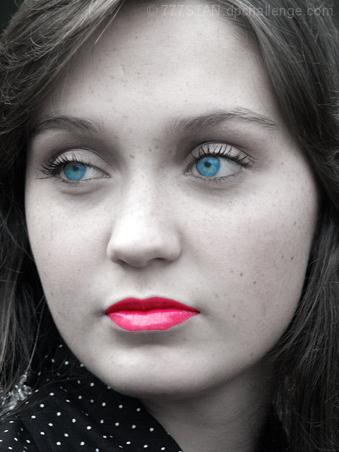
Rotate Left 90, Auto Color Correction, Auto Contrast, Auto Levels, Duplicate Layer, (Elliptical Marquee, Layer via Copy) 2X, Merge Down, Magnetic Lasso, Layer via Copy, (Enhance Saturation, Equalize, Red Photo Filter, Crosshatch, Guassian Blur, Smart Blur...all on Lips), Master Opacity Change on Background Copy, Eraser Tool multiple times, Enhanced Saturation on the Eyes, Merge Visible, Sharpen, Sharpen Edges, USM, Resized, Saved for Web
I knew with intense clarity (less than 12 hours after the challenge began) that I had made a hideous mistake.
Just as one drop of blood draws every shark in the area inappropriately-PSed "lips" cause a "feeding-frenzy" among photographers. (Certainly not an accusation, it's merely an observation of what I'm sure I would have done were the roles reversed.)
Since you were most gracious to point out the excellence of my model (of whose visage I readily admit to marring), I have included some of her originals from that same session as well as other of my first attempts ("I know") at selective coloration.
I am in agreement with your comments, and I am grateful for very clear pointers in a truly-painful lesson.
For what it's worth, this photo of Annelise is an attempted-homage to some of the great photographers on this website. I make no defense of skills on this date as being anywhere close to their level. I simply repeat what I have said before, "I have to start somewhere."
Finally, I take away from this experience to encouraging thoughts. First, you recognize that my skills have improved, therefore you are no longer "going easy on me." Secondly, I now know that my powers of observation & my ability to self-teach are still strong because my own visual comparison of my photo with those that inspired it shows me that I am close to excellence, yet I need to develope a steadier hand, create a photographer's version of a painters "steady stick," or find/use other tools for clean/subtle transition between color & desat. :)
Statistics
Place: 389 out of 415 Avg (all users): 4.3550 Avg (commenters): 4.3600 Avg (participants): 4.4235 Avg (non-participants): 4.3043 Views since voting: 1032 Views during voting: 310 Votes: 200 Comments: 27 Favorites: 0
The lighting is good maybe just a tad bright on the nose but that's just a nitpick. This works well centered. The color on the lips look fake as if painted on or perhaps that was the result of desaturation/masking? If so you should definitely use a softer brush.
This is a very pretty image, but I'm having trouble with the lips. It's not that they are alone with color (besides the eyes) but the color seems to be painted on, and does not cover the natural curve of her bottom lip. It is also probably too bright, even with the contrast you were apparently going for. I think the idea might work, but this execution didn't get there for me.
This would have got a much higher score from me if it was straight b&w, or f it was in colour. To me it looks as though you used selective desat just because you can rather than because you have made an artistic choice. The cut out of the lips, in particular, is rather clumsy, and I find it difficult to see the rest of the portrait!
the portrait can be good but the postwork is terrible. with advanced editing you can clean the moles. the eyes are good. the lips..... here there is the true problem for this image. 5
i don't usually comment on photos but seeing that i gave this a low mark i feel i should . The eyes colour looks false and against the washed out face, and the lip colour is far too bright and poorly applied, giving the face a ghostly look.
4 processing doesn´t help, on the contrary, it hurts the image. Instead of saying: look at this beautiful young lady, this photo says: look how skilled I am with the photoshop. To make the things worse, I don´t see a skill in postprocessing.
The post processing on this pretty girl is a little overdone. The eyers arn't too bad, but her lips look very strange - as if they belong to someone else
It looks like the pink was painted onto the photo rather than being a "revealed color" from the original. While that's cool... I just think the sharp edges on the lips is distracting because the edges of the color don't seem to match the shape of the lips.





 Add photograph to your favorites
 Add photographer to your favorites

 Photographer found comment helpful.


