Positives:
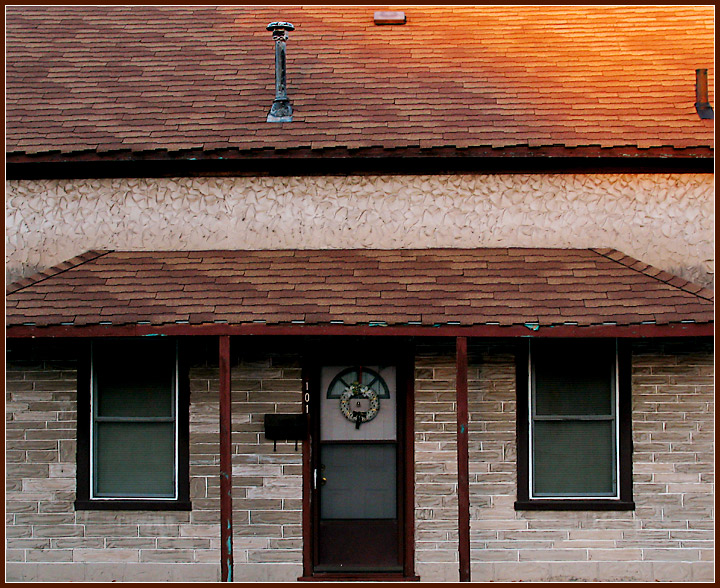
There is a lot to like about this image. The care you've taken with the symmentry in this composition is exceptional, as is its sharpness. The technicals are well above average and color is good. It is one of those images that are interesting but the viewer has trouble saying why. Only a true photographer would take a picture like this.
Technicals:
As I said, overall the technicals on this image are exceptional and well above average. You have to get nit picky to find faults. Some faults you have control of, others you do not. You've done so well that the slight tilt of the building somewhere between .1 and .4 degrees actually becomes noticeable.
The lighting on the roof, though a nice golden color detracts from the overall symmetry of the rest of the image. The blue specks along the edges of the roof are distractions I'd recommend cloning out. The tubular vent on the right is to close to the edge of the frame. Cloning it out might have been a good idea but I'd ask about that first.
The challenge:
Free study images tend to be above average submissions at DPC. The unbalanced lighting on the roof is the killer here. You were probably hurt by that and the fact that static 'photographer eye' images like this tend to score lower than others. Yours is very much an above average image but got a below average score.
I like the lighting on the roof that adds that pleasent yellow to the image. I don't like the crop of the door that tight. I am sure there is a reason, but something looks a bit odd imo. 6






 Add photograph to your favorites
 Add photographer to your favorites

 Photographer found comment helpful.


