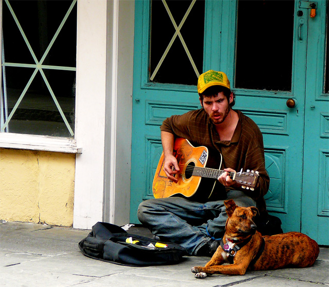
I like this image but two things I personally would have done diffrently. I would decrease the saturation and increase the contrast instead, seems a bit too saturated for my taste and a bit flat on the constrast side but that´s just me.
Well that or make it b/w and high contrast, would make the mood "pop" more but like I said, I like the image, well composed and great subject choice. |




 Add photograph to your favorites
 Add photographer to your favorites


 Photographer found comment helpful.
