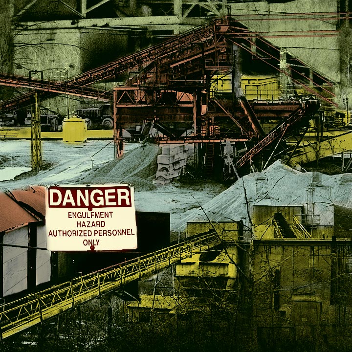
This is a composite of about 7 photos taken at Saxton Falls Sand & Gravel. Many things (levels, curves, hue/saturation, selective color, filtered layers merged with different kinds of opacity) were done to individual images and to them all as a whole. I did calculate to convert to b/w, then I converted to a tritone, then I brought it back to RGB, put some more curves on it. Then I painted some colors on it in Multiply mode.
Statistics
Place: 30 out of 116 Avg (all users): 6.1330 Avg (commenters): 5.8667 Avg (participants): 6.0984 Avg (non-participants): 6.1465 Views since voting: 3830 Views during voting: 369 Votes: 218 Comments: 28 Favorites: 3 (view)
you really have processed this perfectly...the yellows are harsh, and that bridge that is drawing me in almost gives me a bit nauseous feeling...
all that and Larus doesn't like it...what could be better?
An interesting thing - I never stopped to figure there were multiple images. I mean it kinda seems like there must be, but it really hangs together so well that the mind doesn't question whether or not it logically CAN fit together, simply because it DOES fit together. Scary that you scored so high and didn't simply create a "DPC friendly" image... wonder what THAT says? And there's no explaining my sudden urge to type whole words in CAPS. I think it has to do with my aversion to the folks that alTERnatE case in their titles. Drives me nuts.
I hardly know what to say. I love this composition, but don't know why. Everything about it pleases my eye. Someone said it is busy. I think it is infinitely interesting. I gave it a 10.
9 - enjoyable montage. Muted/subdued/filtered colour intensity has an appropriate quality and somehow complements this gravel pit. Pasted placard bolted on air, resting on a thin rod, provides identification and a quick entry for my eye to begin exploring. In the end, the sign is awkward. I want a way to have an option to remove it, or make it smaller, and see these texture/composition relationships without such a loud warning.
Sorry but something about the look of this image just doesn´t agree with me, I can´t put my finger on it but the cartoonish coloring along with the low contrast, I dunno, just not my cup of tea, sorry :(
What was the point of the post processing treatment on this shot? Does it change the mood of the image or bring the point across more ? Looks like something of a screen print or similar tonality now.
I've looked at this for quite some time now, and finally conlcuded i don't like it.
Lol, sorry.
It's the comic book colouring and the haphazard composition, just not to my liking.
This is very busy. It is good that you used a square crop for this otherwise within the constraints of allowable screen real estate you would have a mish mash of details. As it is it's just too busy. It confuses the eye. It doesn't know where it's supposed to end up.
TC
What the heck is 'Engulfment Hazard'? Hang on...going to Google.......ok, I'm back. 'Engulfment Hazard - In many worksite situations, workers are at risk for engulfment hazards. Engulfment results when a worker is surrounded and overcome by a granular substance such as soil, sand, gravel, sawdust, seed, grain or flour or if submerged in a liquid such as water or a chemical. Engulfment causes physical harm when the material has enough force on the body to cause injury or death by constriction, crushing or strangulation. Respiratory hazards associated with engulfment includes suffocation from breathing in a fine substance that fills the lungs or from drowning in a liquid.'
Yoikes, note to self: signs are put there for a reason. Nice capture and cool pic!
This appears to be a collage different photos. The different perspectives make this a very difficult image to understand what I am viewing. I think this could be improved if it were not so busy.
Hmm im not sure i like the bright colors here, you can see some of the colors overlaping each other like on the red pile to the left of the big sign. The sign itself looks a tad fake, the brightness of it makes it standout from everything else.







 Add photograph to your favorites
 Add photographer to your favorites

 Photographer found comment helpful.


