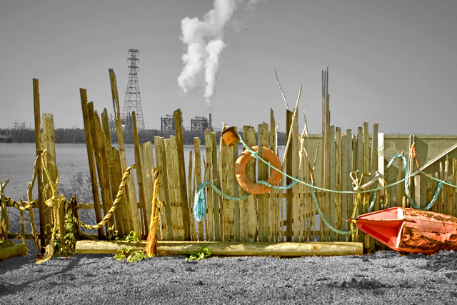
GREAT use of contrasting subjects. It kind of reminds of John Pfahl's "Power Places" series. The selective desaturation also works well.
The one thing I'd like to see is less on the left, so that the smoke, or other point of interest, is more at 1/3 of the frame. Nice. 8
Very nice selective desaturation...I love the contrast between the warm colours of the decaying fence and life preserver and the cold gray of the factories.
Not sure I agree with your choice of desat, but it does add interest and life to the photo. But, it also gives the fence a plastic, plopped down feeling that makes it seem out of place, somehow. Perhaps that was your intent.
This is a neat location but I'm not a fan of the editing. Perhaps if you had gone a little more subtle? Like not saturate the fence so much and not desaturate everything else completely, only a bit.





 Add photograph to your favorites
 Add photographer to your favorites


