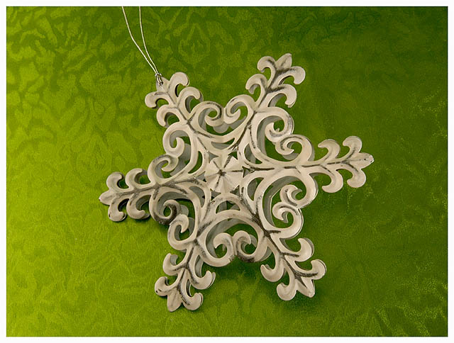
i wish the background could be even MORE prominent, to emphasize the intersection of the patterns by both the subject and the paper. the color is great.
I personally love how the background compliments the color of the ornament - excellent color contrast. For my personal taste, I would like to have seen more sharper detail on the ornament (as far as voting in a challenge). And if you were wanting to put more emphasis on the ornament, I would have done some cropping on the left - the lighter background draws away from the ornament. I like it!






 Add photograph to your favorites
 Add photographer to your favorites

 Photographer found comment helpful.


